SMRTFT
SMRTFT is a Los Angeles based premium fitness brand known for its professional grade adjustable dumbbells and sleek sports apparel. Its products have received numerous accolades, including six Men’s Health Fitness Awards, the AskMen Award, and a top Buy Side rating from The Wall Street Journal. With over 200,000 customers worldwide and more than 1.5 million Instagram followers, SMRTFT has established itself as a major player in the category.

CHALLENGE
When SMRTFT approached us, the brand was facing key design challenges. Their logo felt outdated, while brand materials, advertising, and social media graphics lacked distinction and consistency, making it difficult to build strong brand recognition and awareness.
SCOPE
We began by defining what SMRTFT stands for, followed by a deep dive into its customer touchpoints. From there, we designed a new logo, an identity system, and a brand style guide to establish a clear and consistent visual language. Building on this foundation, we designed (and continue to design) a wide range of assets, including packaging, print materials, user guides, gift cards, digital ads, website visuals, and social media content.
MORE MODERN. MORE SLEEK. MORE SMRTFT.
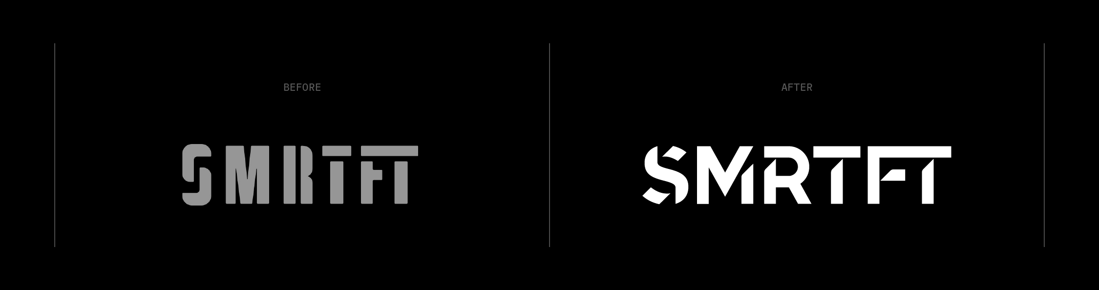
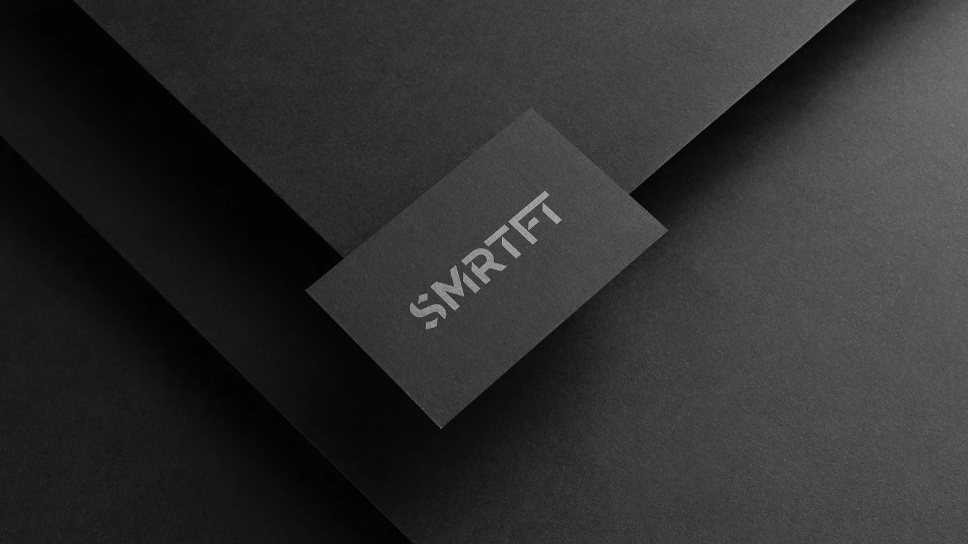
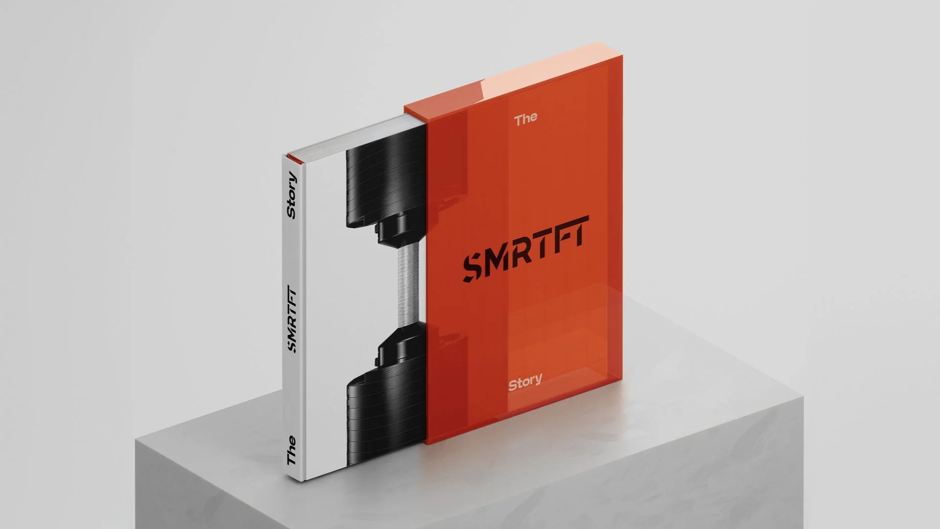
Everything started with the new SMRTFT logo. The objective was to modernize the existing wordmark while paying homage to its original form without alienating its audience.

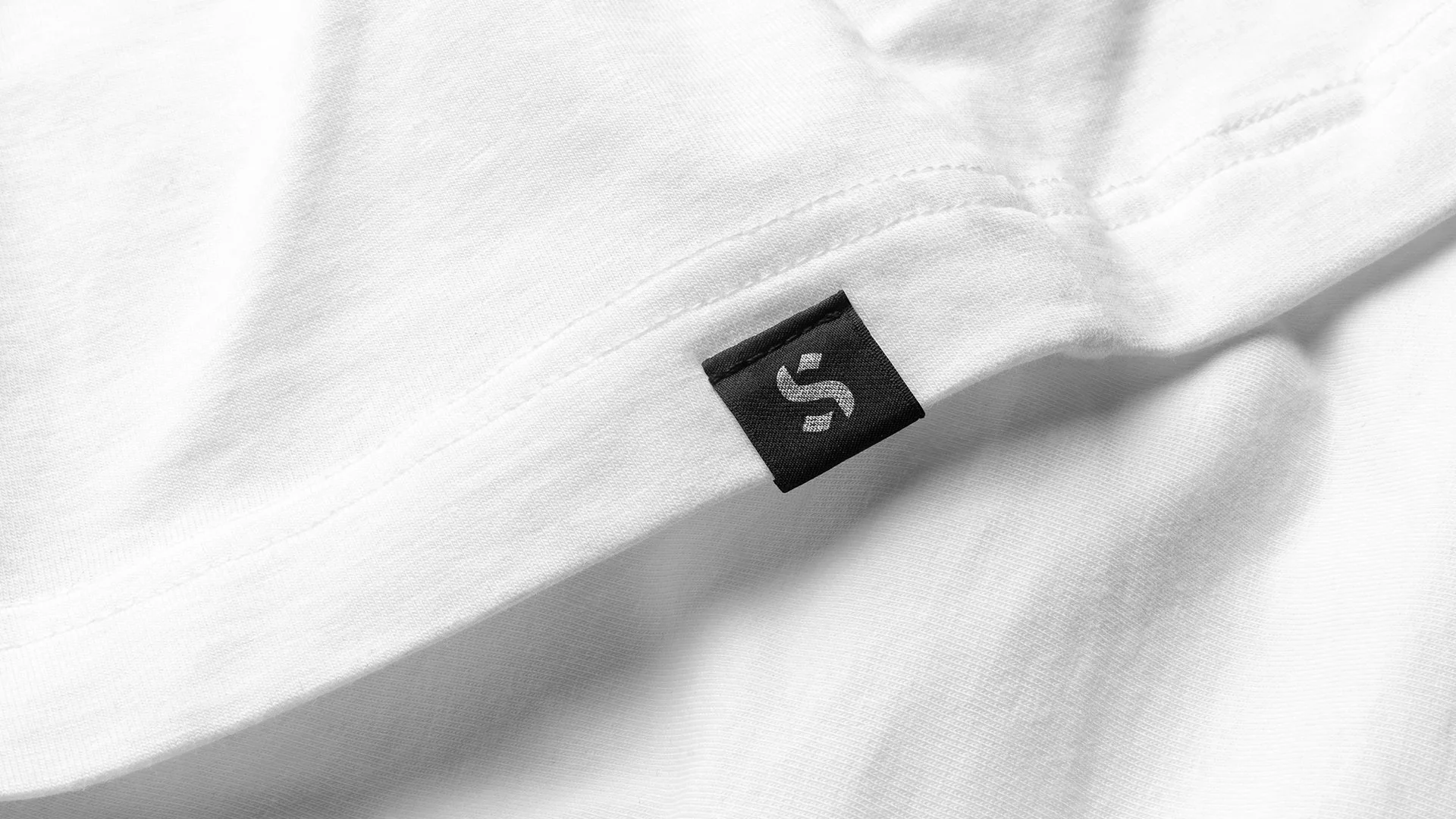
We introduced a contemporary sans-serif foundation for the new logo. The “S” was redesigned to feel more dynamic and current, while the “FT” ligature was refined with consistent diagonal cuts, echoing a core idea in professional athletics: continuous upward progression toward a stronger, better version of oneself.
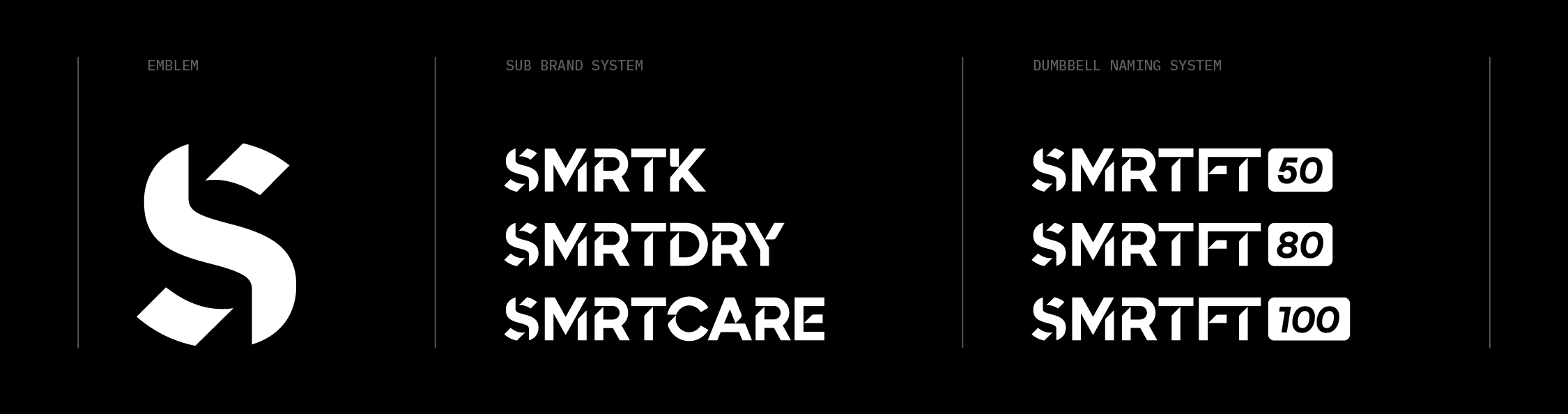
Finally, we implemented a modular and consistent sub-brand system, along with a redesigned product nomenclature. We transformed “SMRTFT 50lb Adjustable Dumbbells” into SMRTFT 50, creating a more memorable, iconic, and scalable identity.



A BOLD AND MEMORABLE DESIGN SYSTEM
Following the development of the new SMRTFT logo, the next step was to build a cohesive brand system and typographic language that reflects the brand’s personality. At its core, SMRTFT balances two contrasting qualities: premium elegance and performance driven strength.
The design system brings these opposites together, combining refined, minimal aesthetics with a bold, dynamic visual expression rooted in the world of fitness.
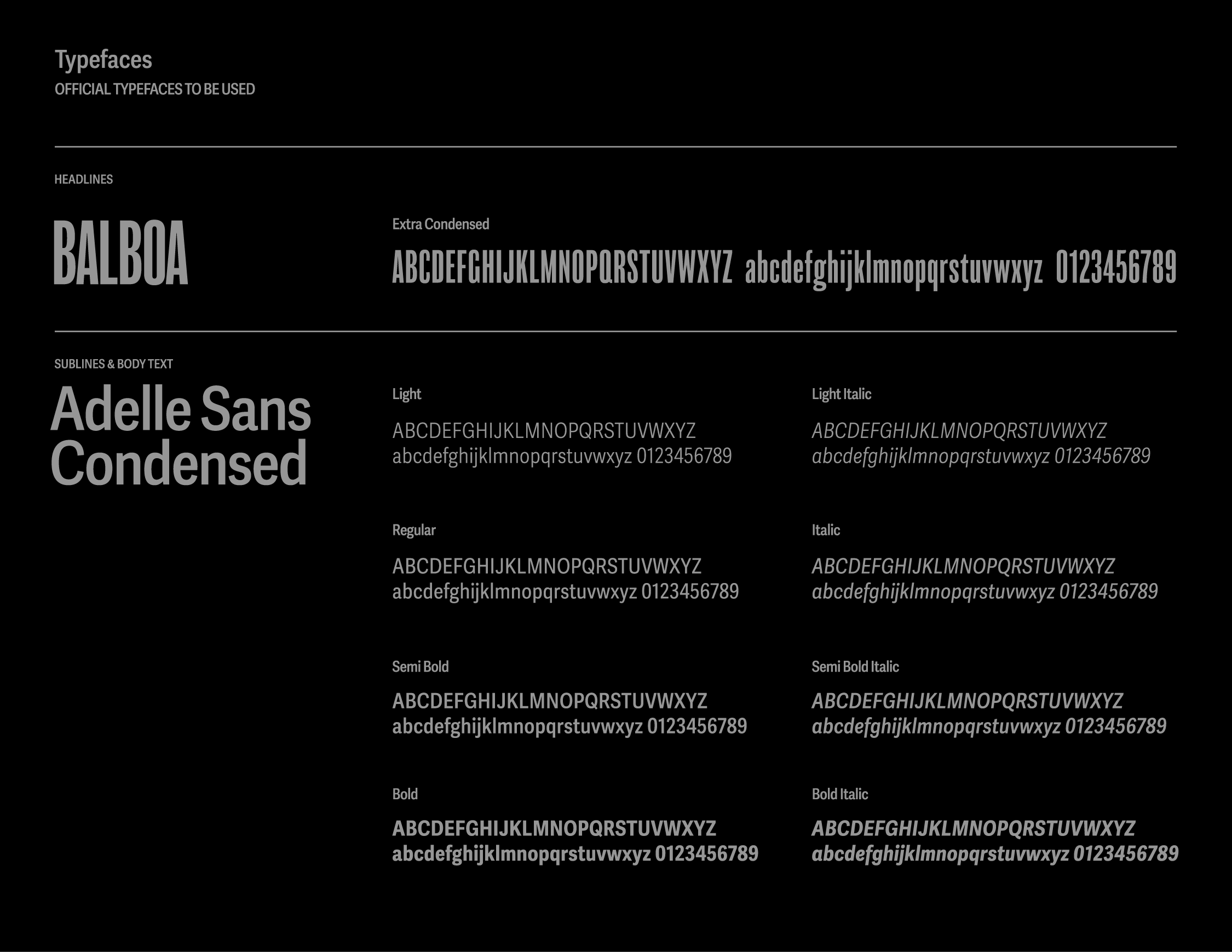
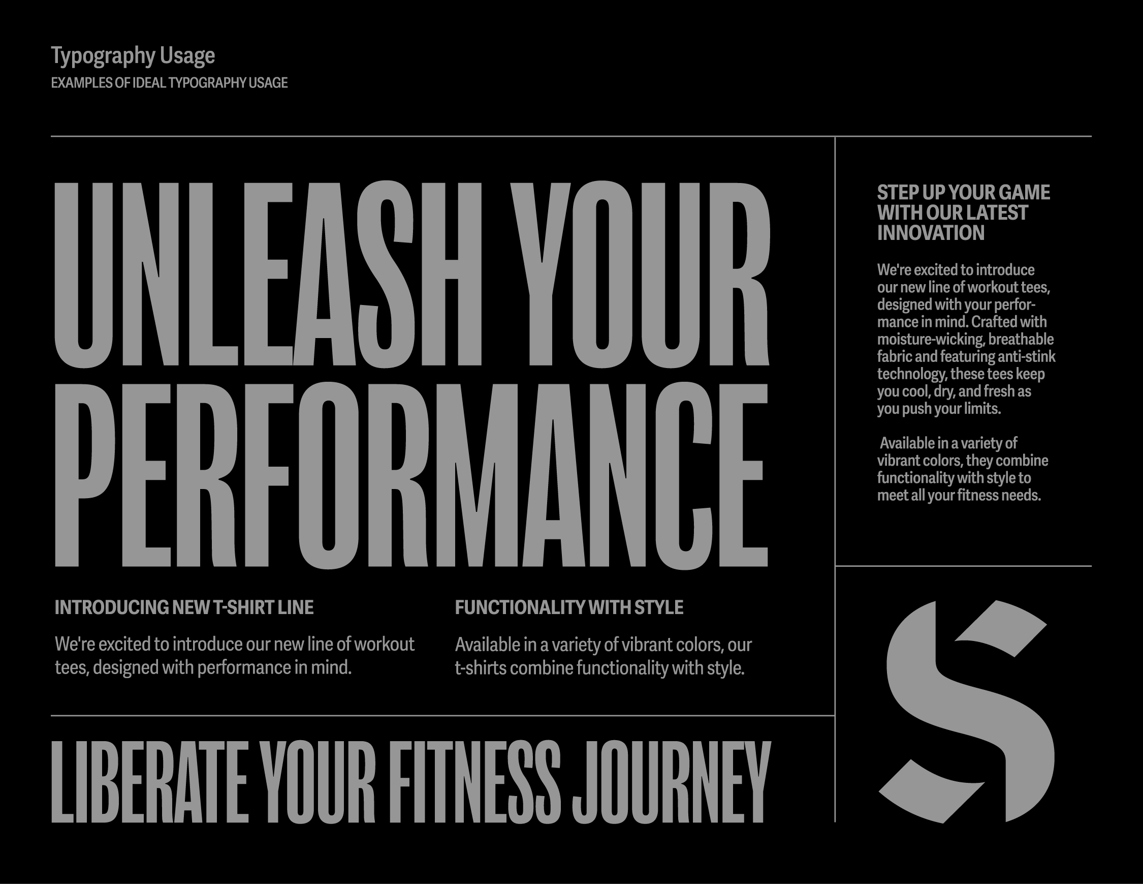
The result is a distinctive yet versatile system, featuring clean, sleek, and flexible layouts, the bold and extra condensed Balboa typeface for impactful headlines, and the highly legible, strong Adelle Sans for body text.

A DISTINCT PHOTOGRAPHIC STYLE
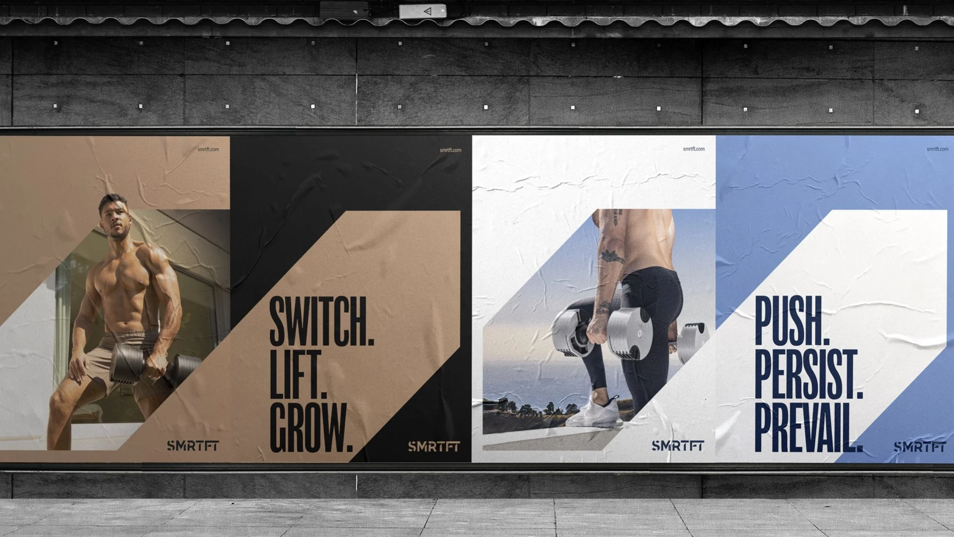
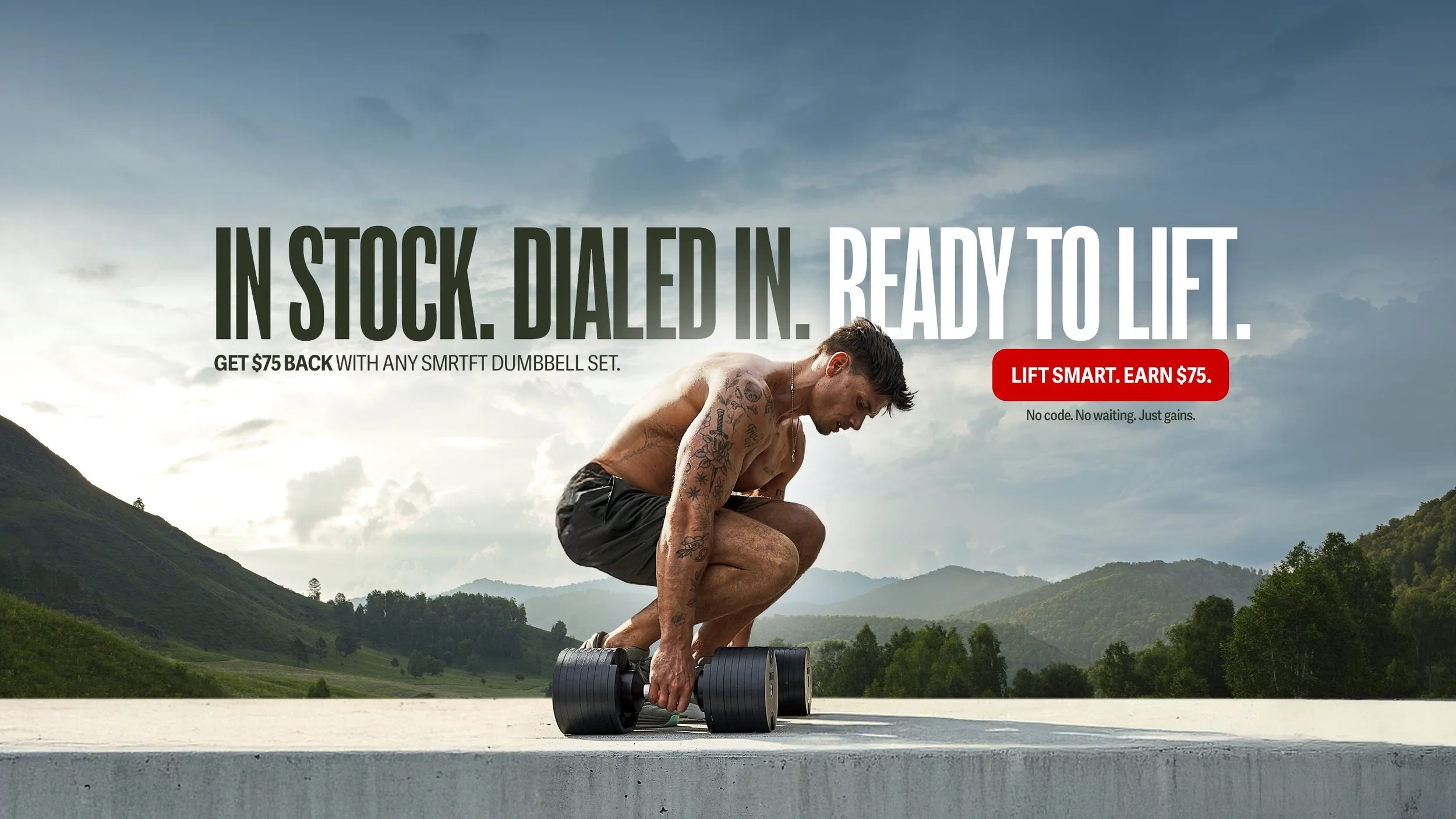
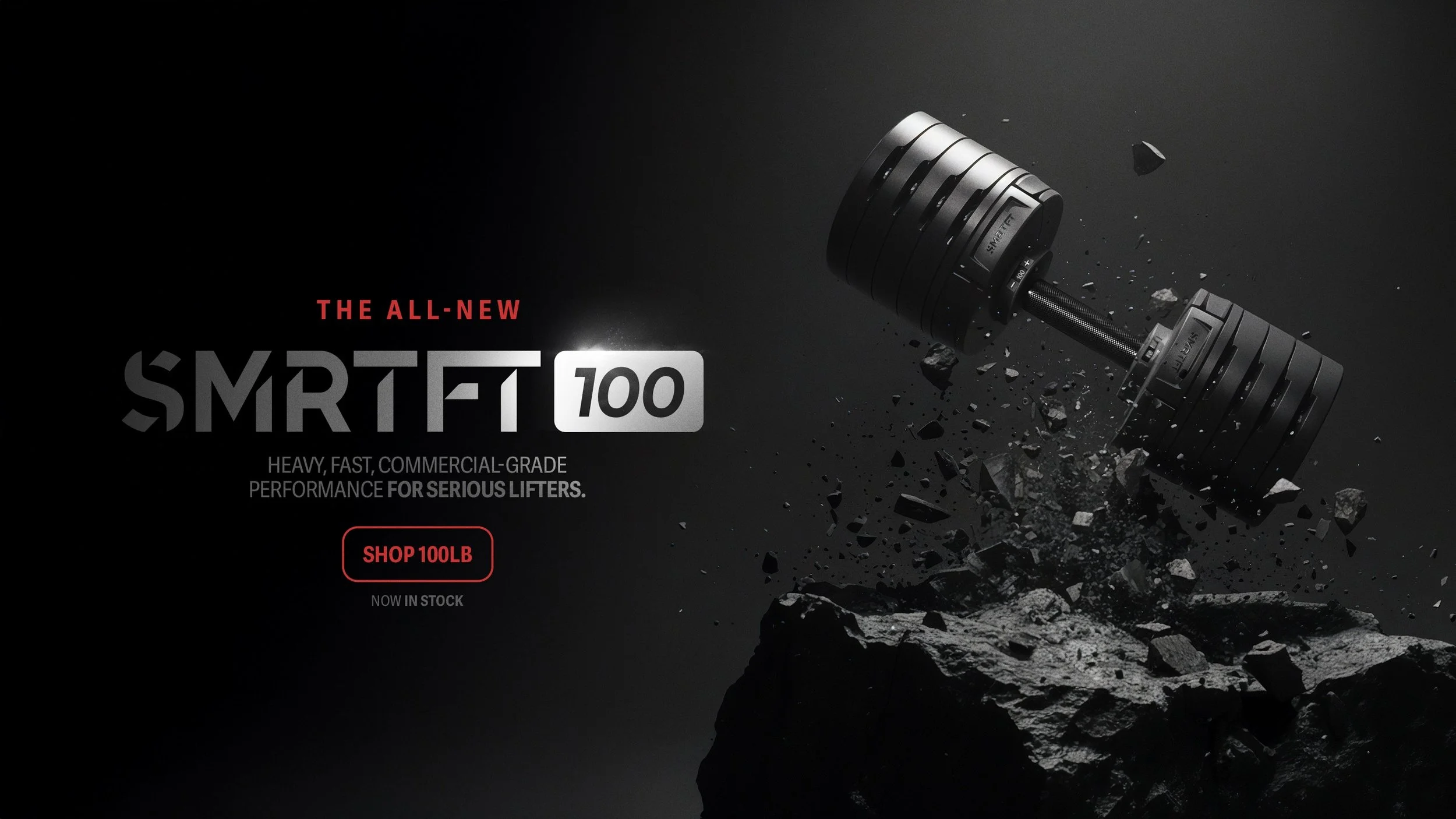
To bridge the gap between premium brand aesthetics and performance-driven intensity, photography plays a central role in the visual system.
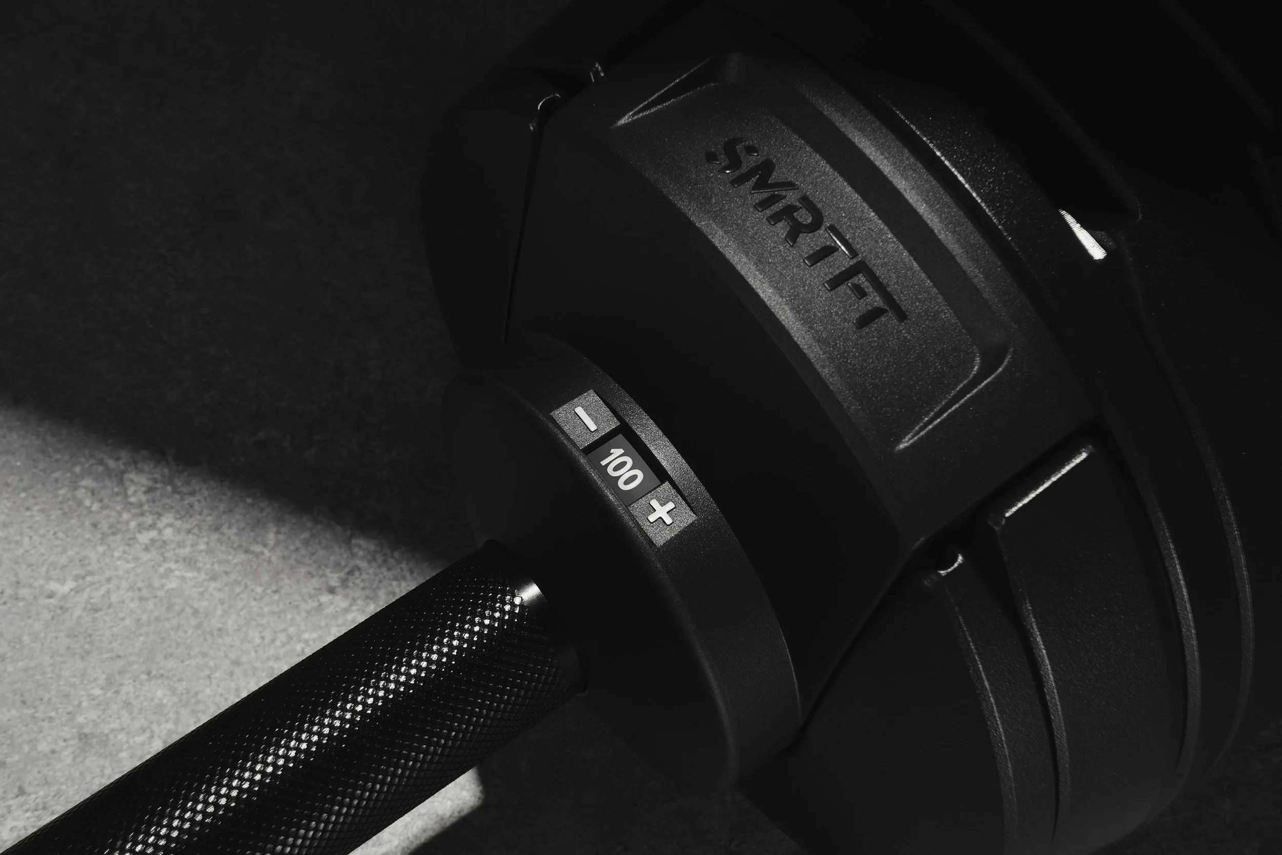
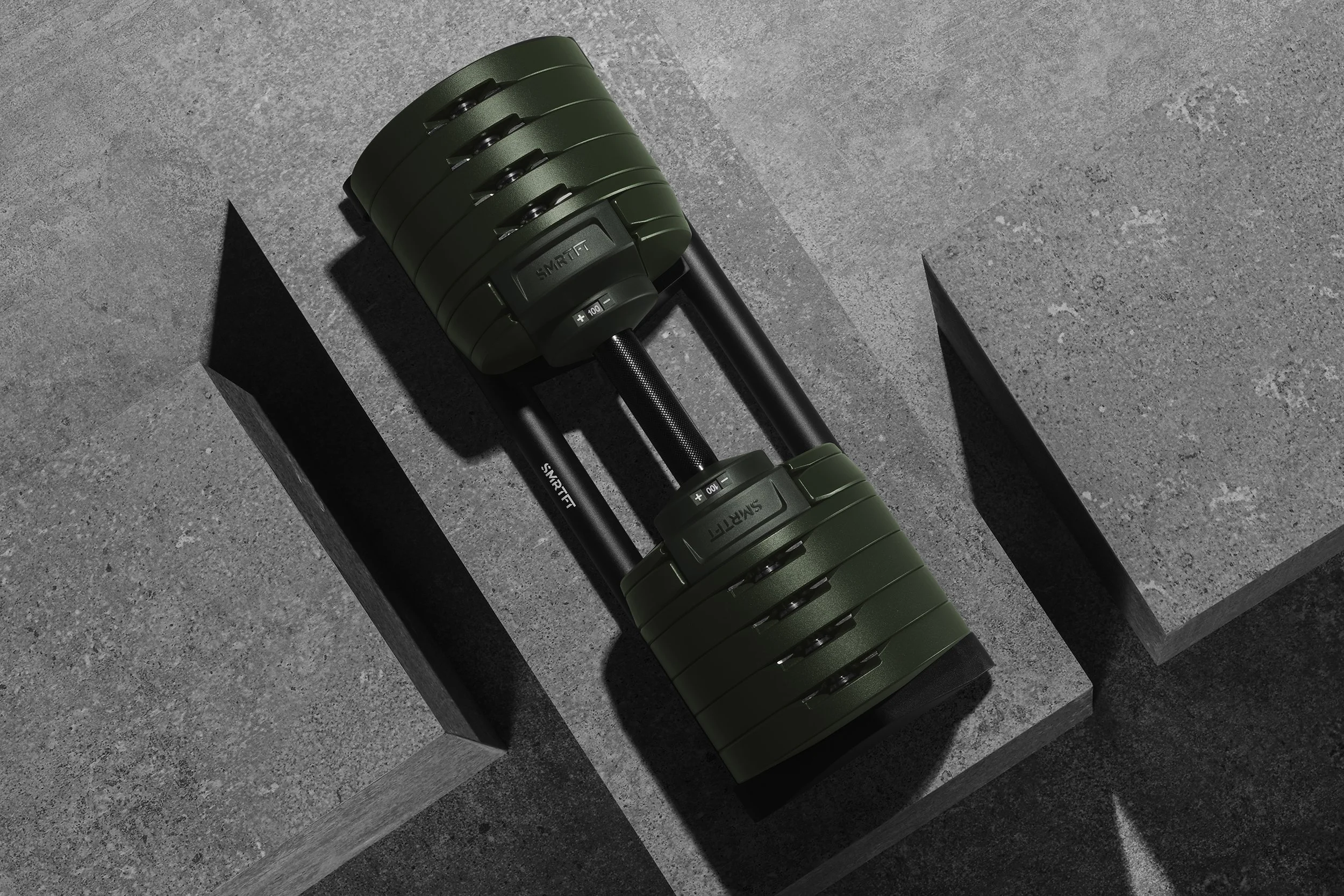
We crafted imagery with generous negative space, and a strong, iconic composition language. Dramatic lighting, open skies, and textured architectural backdrops create a refined yet powerful atmosphere, while subtle geometric cues reinforce the brand’s minimal and structured visual identity.
Here is a small selection of website cover images we've created:


SOCIAL MEDIA, E-MAILS AND DIGITAL ADS
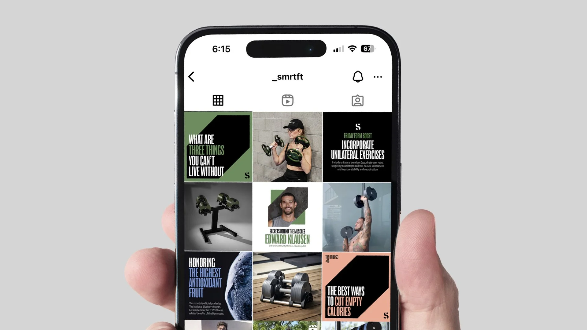
SMRTFT is a product brand, but more importantly, it operates as an education driven platform for fitness enthusiasts. Instead of focusing solely on selling dumbbells, the brand collaborates with experienced trainers, writers, and influencers to deliver training insights, nutrition guidance, and performance education.
As the ideal medium to share such content, social media has become its natural core channel. This education driven approach has helped SMRTFT grow a highly engaged audience of over 1.5 million followers on Instagram.



Another key touchpoint is email. Each week, SMRTFT sends carefully crafted, original content to thousands of subscribers, extending the brand experience beyond social platforms and into a more personal, direct channel.
We applied a color coding system to SMRTFT’s content categories, Fitness Focus and The Other 23, making the newsletter structure more intuitive and instantly recognizable.

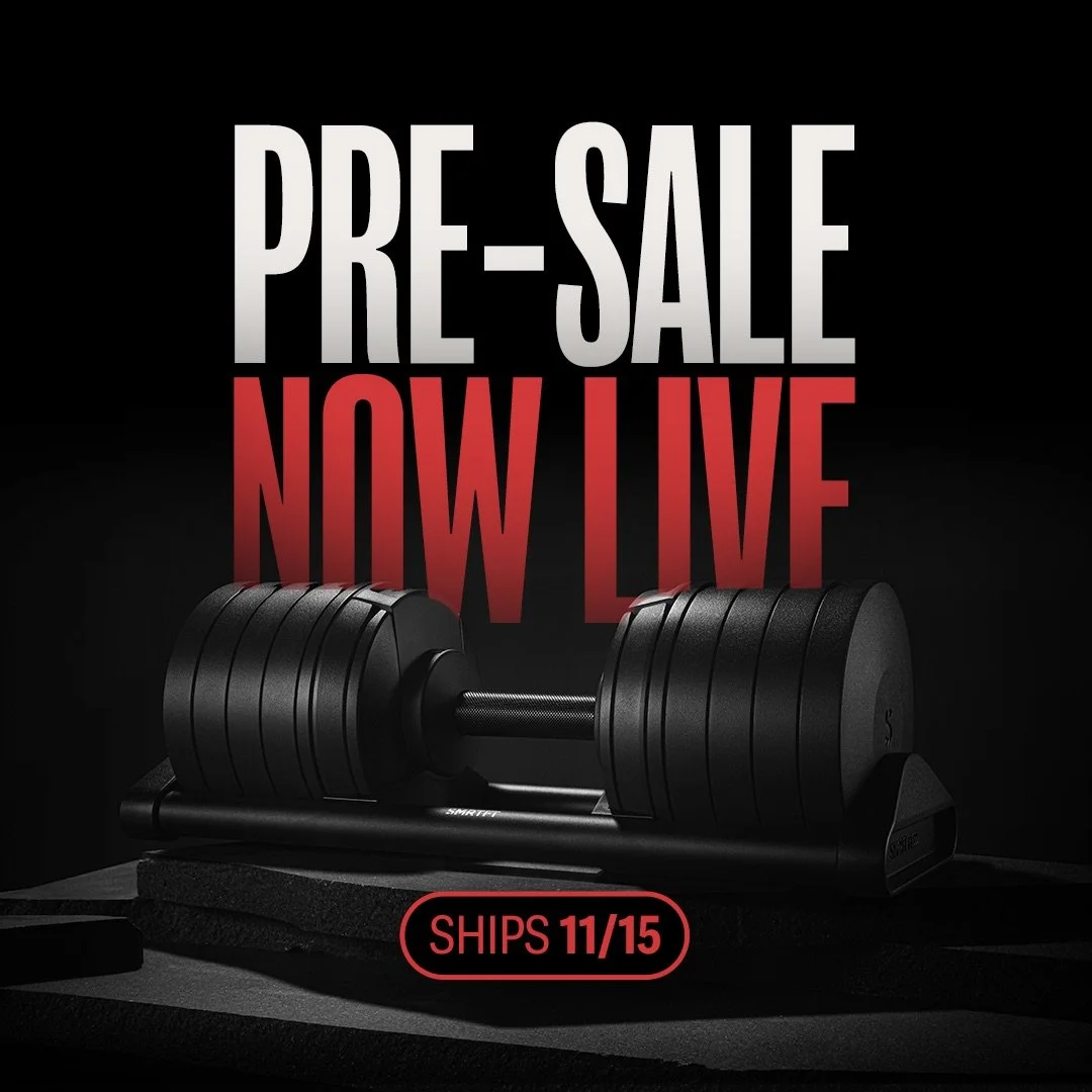
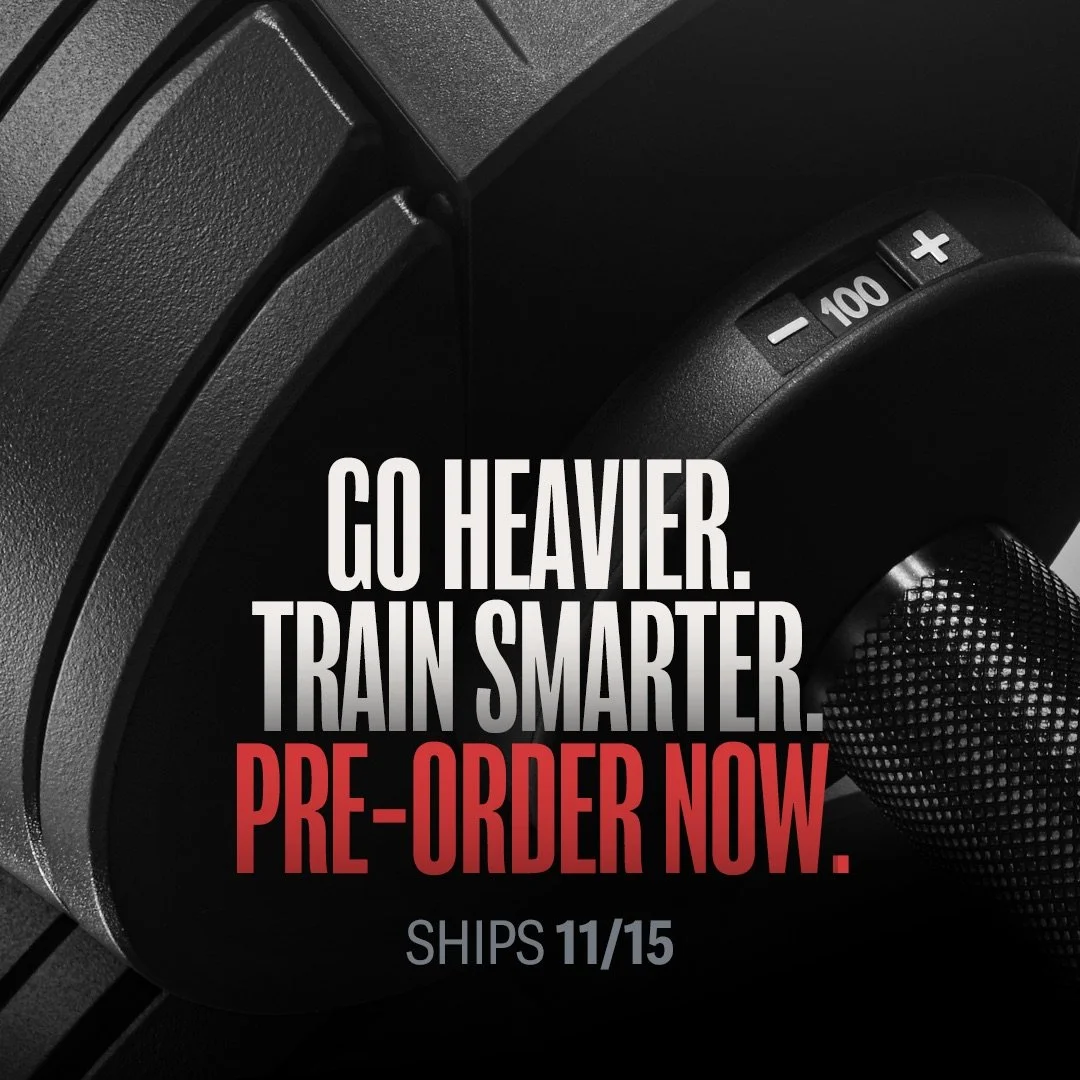
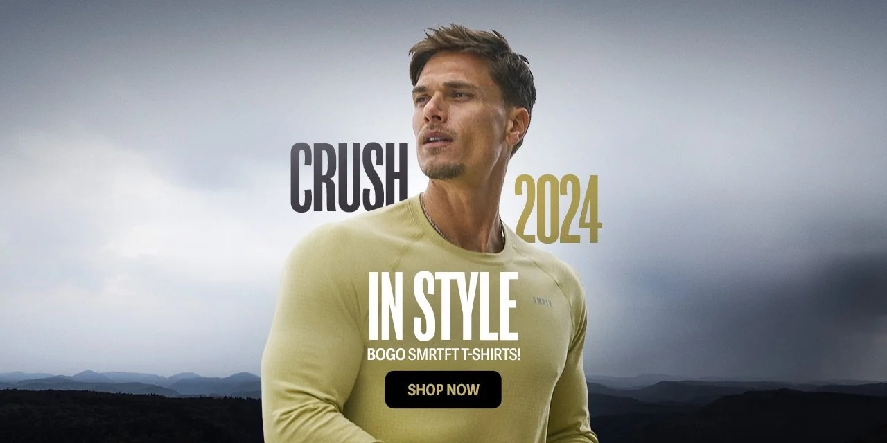
For conversion and sales, SMRTFT relies heavily on digital advertising. We designed a range of campaigns across product launches, seasonal promotions, and key retail moments such as Christmas and Memorial Day.
Across all formats and objectives, the goal remained consistent: maintaining a unified visual language and tone of voice to reinforce a cohesive SMRTFT brand experience.