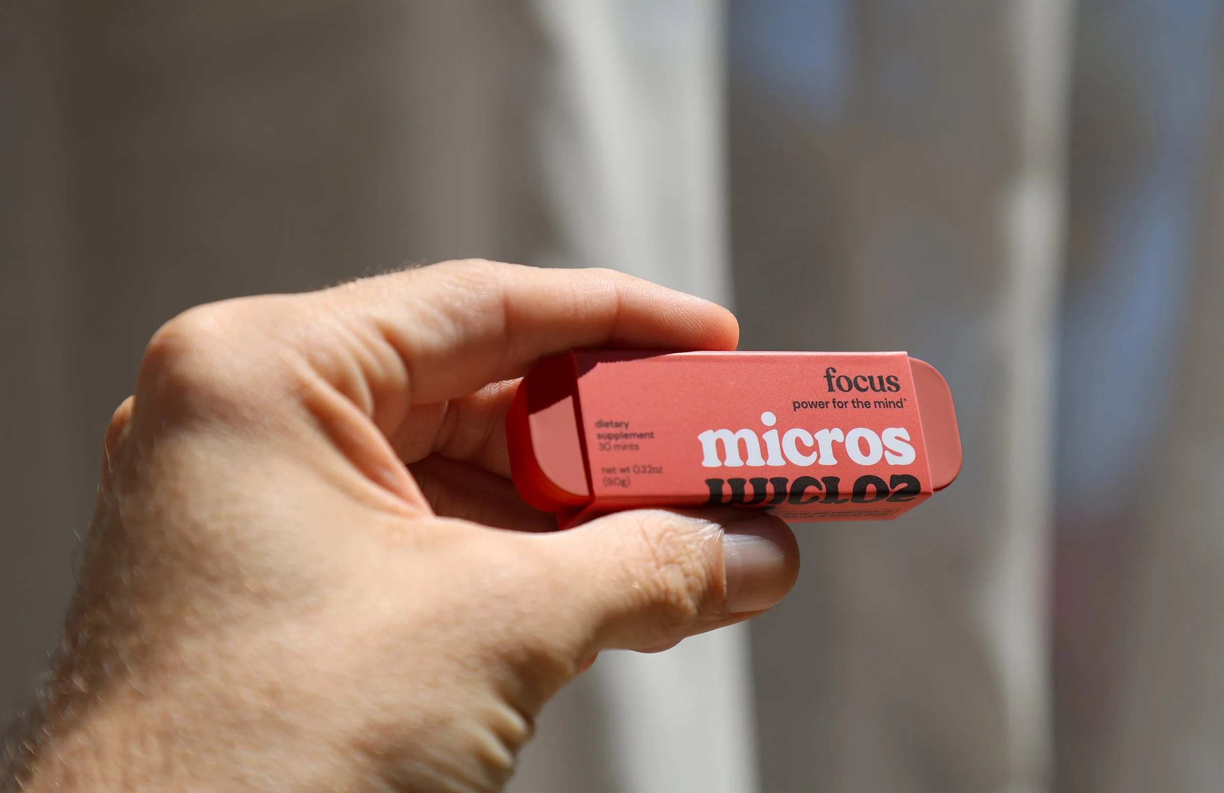
micros
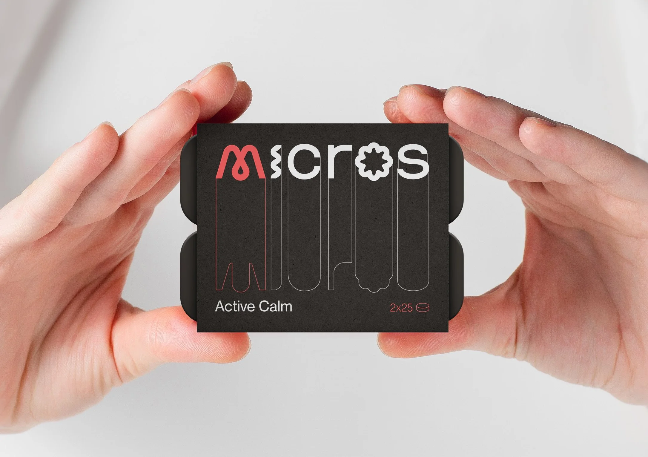
micros is a precision-formulated mint designed to help people feel exactly the way they want. Trouble focusing? Choose focus. Can’t sleep? Go with sleep. It’s not an addictive drug or a long-term supplement, but like a dial you turn to find the feeling you need, right when you need it.
That idea resonated deeply with us. At Ozan Karakoc Design Studio, our mission isn’t all that different: we help our clients choose how they want their audience to feel. With micros, we began the branding journey from that shared perspective—identifying the emotions the brand needed to spark in its customers in order to stand out in an increasingly saturated market.
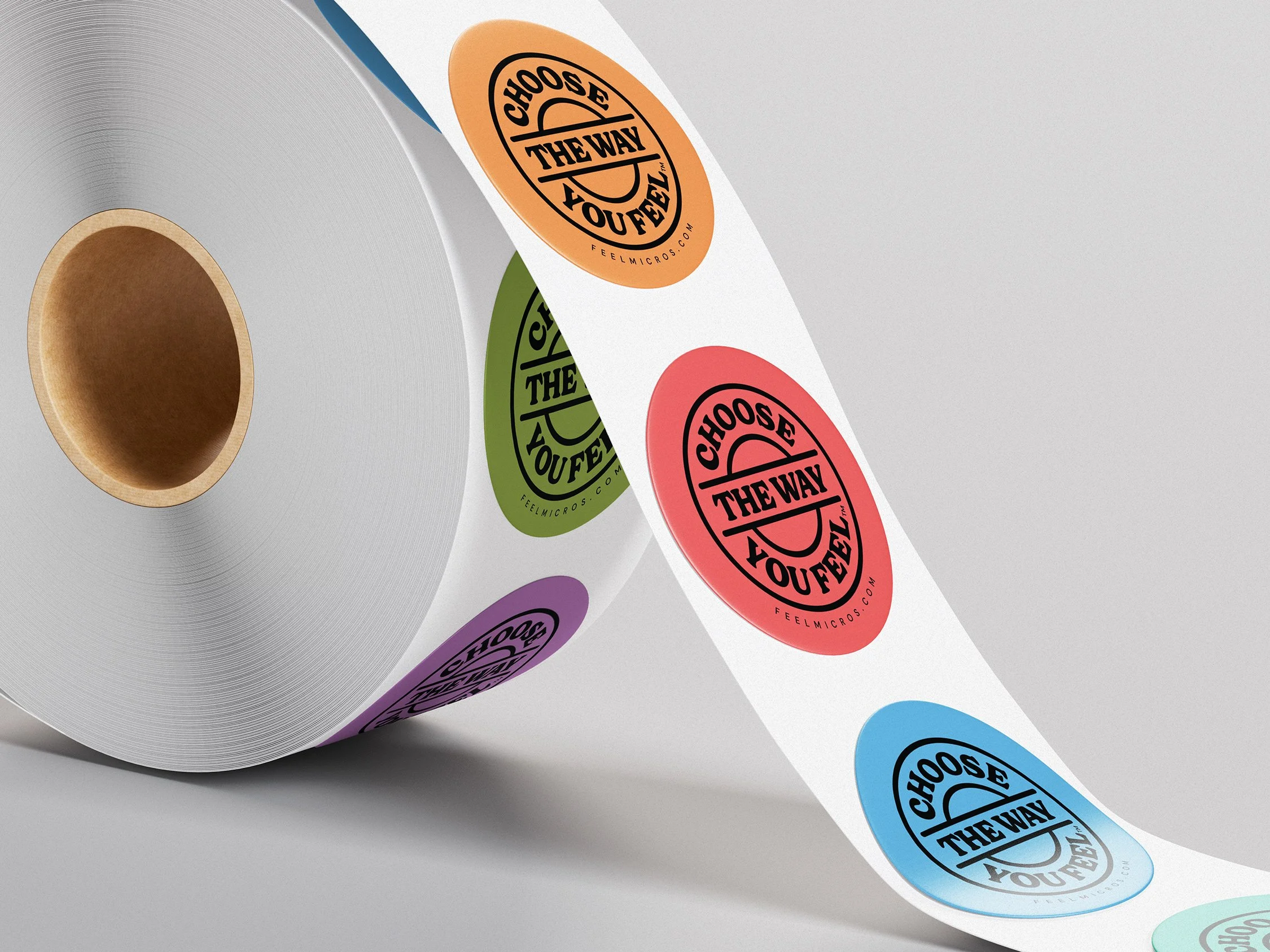
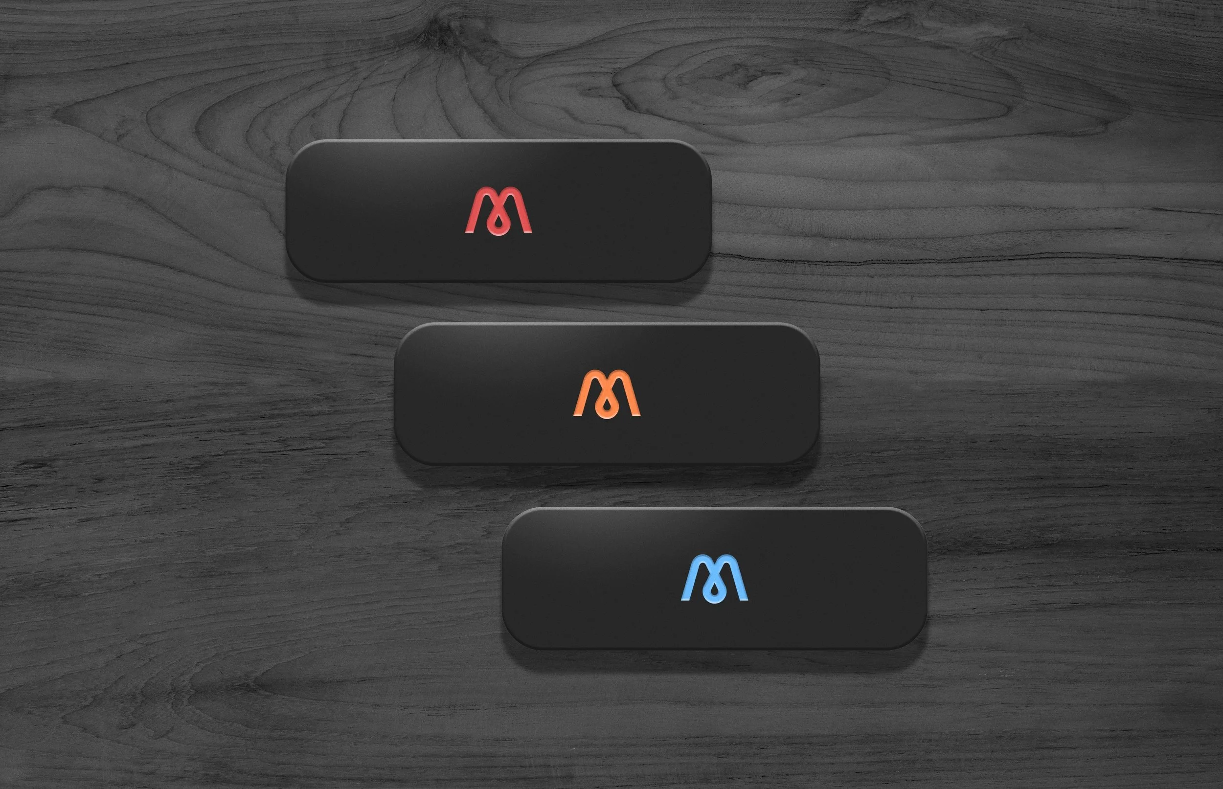
Each product’s benefit was color-coded with clarity and intention.
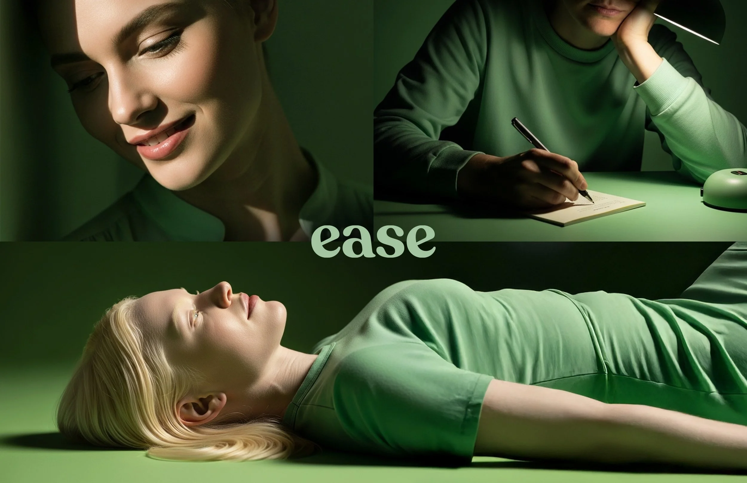
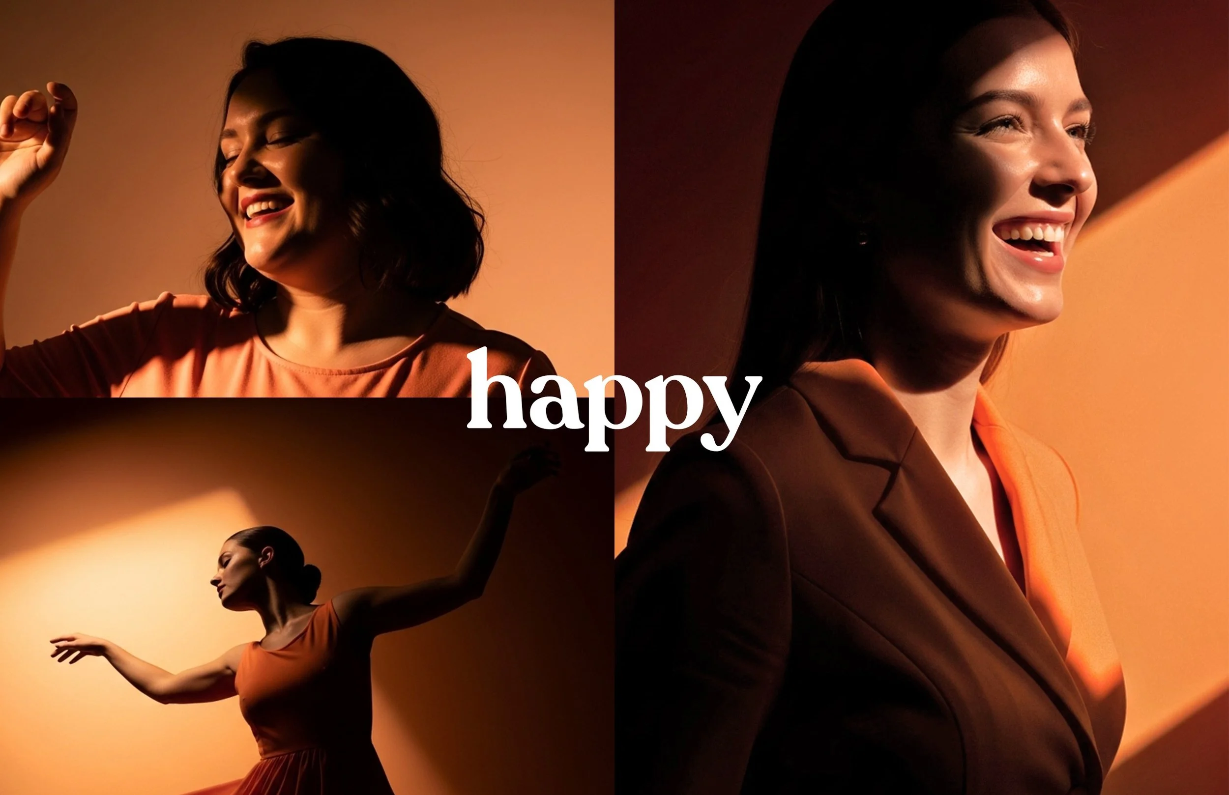
Red, chosen for focus, brings an energizing sense of alertness; blue, for sleep, evokes the calm of the evening sky; green, for ease, suggests the smooth flow of a green light; and orange, for happy, adds a playful and uplifting touch. Each tone is slightly muted to reflect the brand’s calm, peaceful essence.
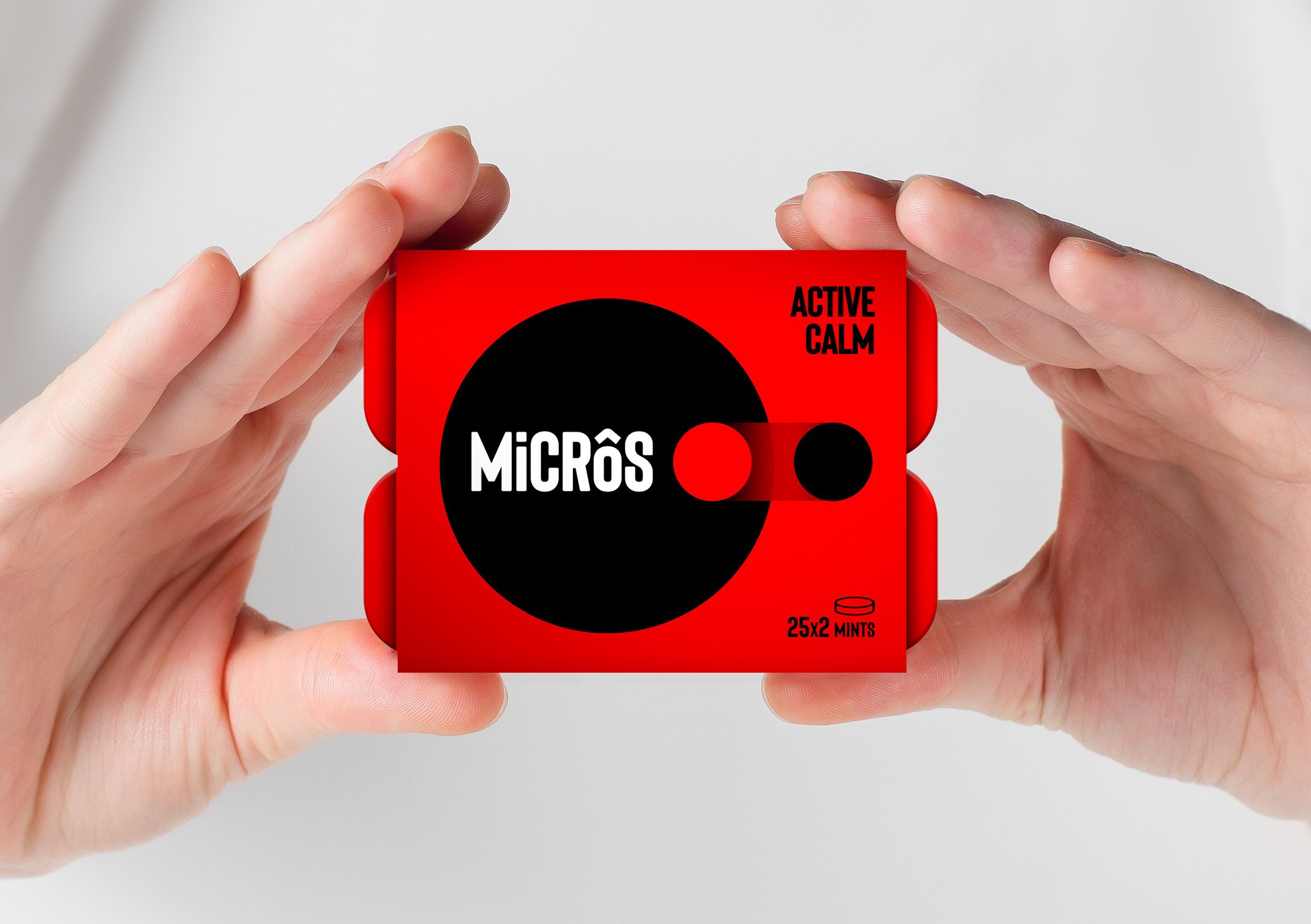
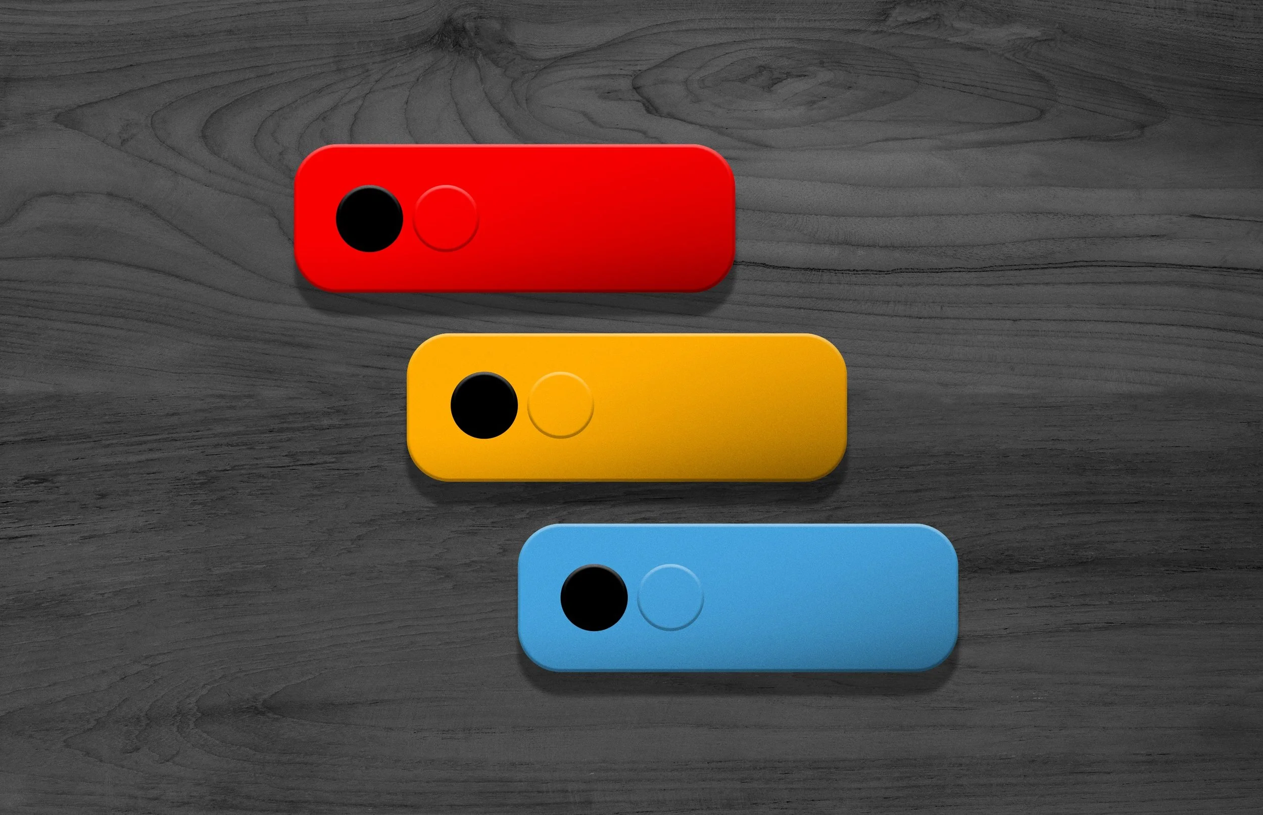
Bonus: A Look at Initial Possibilities
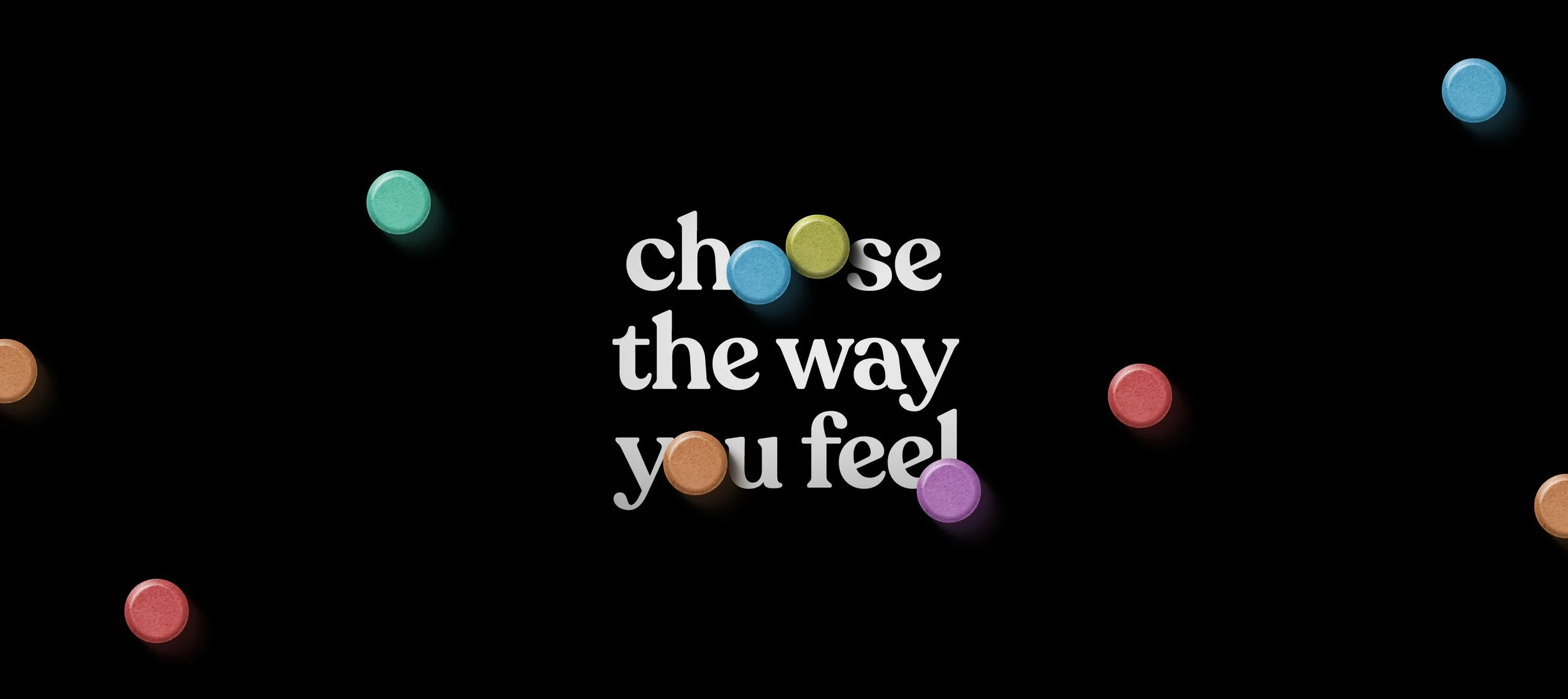
Design exploration for micros was a meticulous process. We closely examined the brand’s vision and future aspirations, experimenting with multiple directions to capture its essence. Below are some of the design concepts that were presented during this phase. While they didn’t make it to the final round like the approved design shown above, they reflect the breadth and depth of our creative exploration.
“Ozan is way more than pixels. He has a gift (and the experience) to communicate essence through design. He’s been as much a strategist as a designer. I trust him.”
AVIN KLINE Founder / micros


