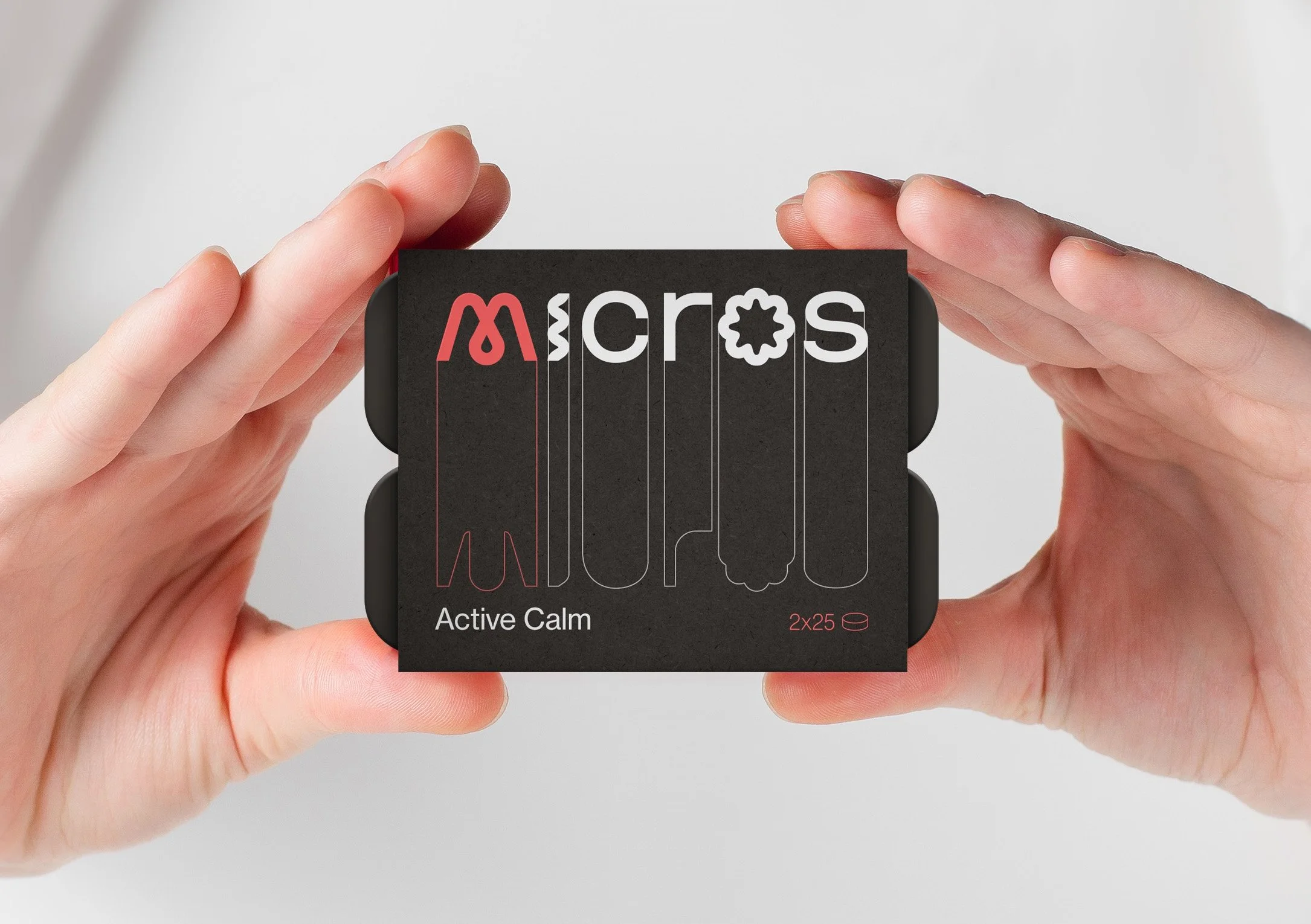
micros

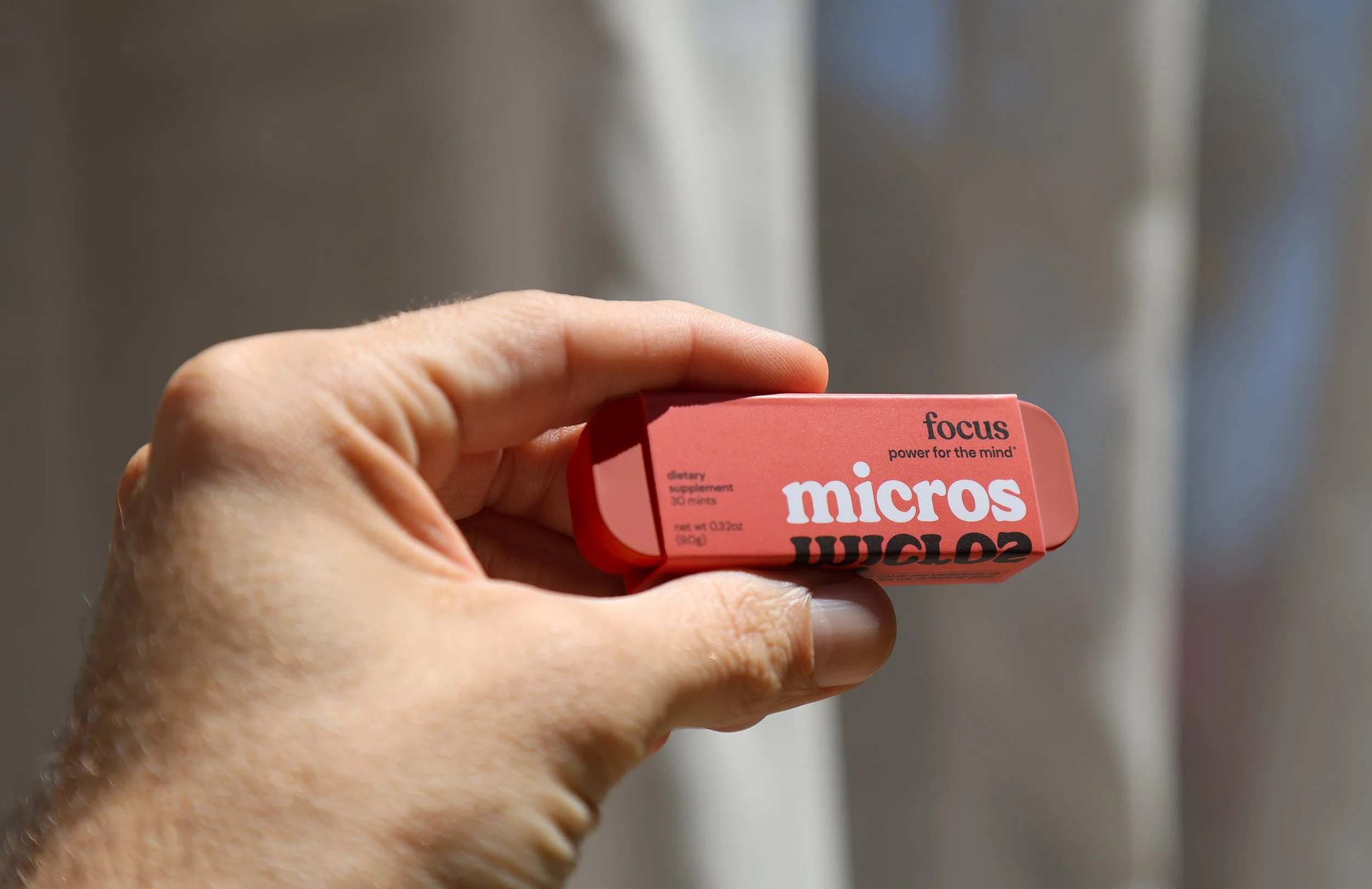
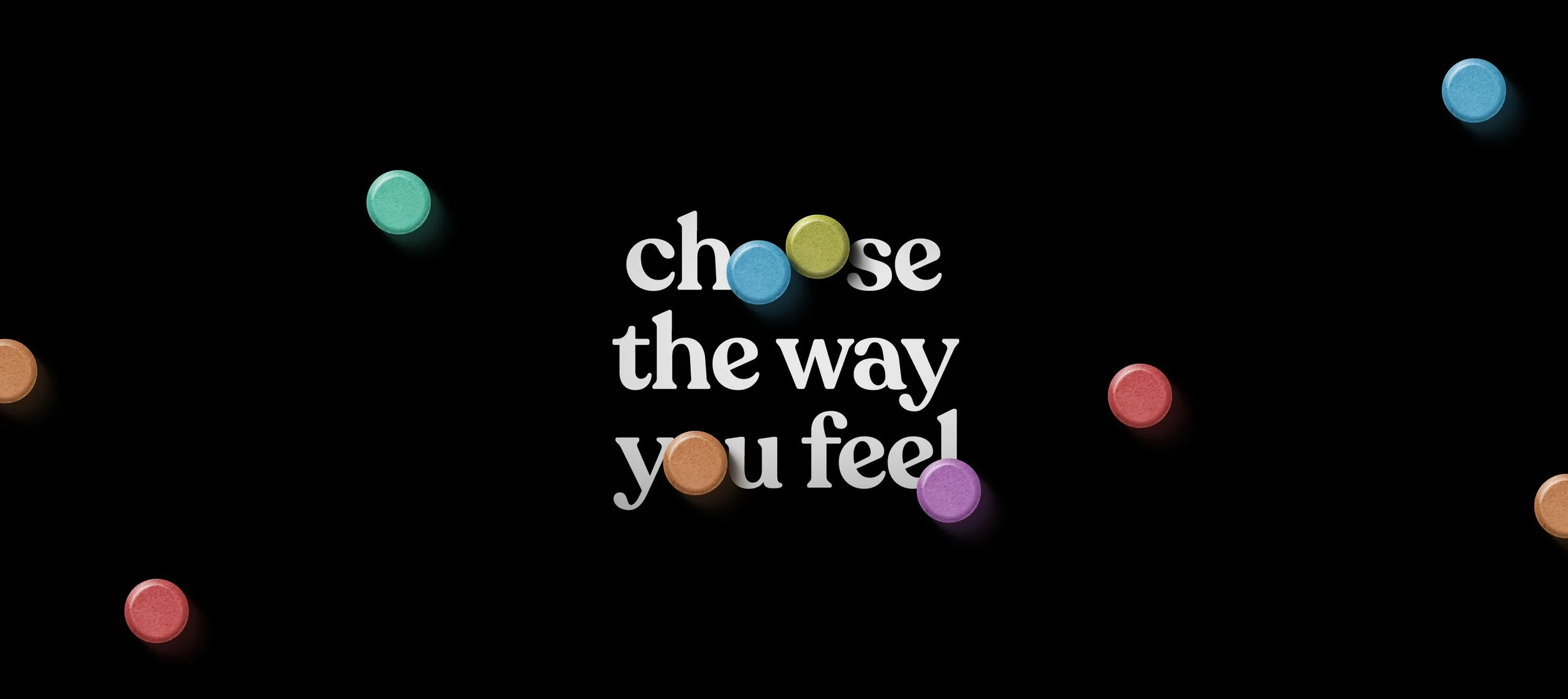
micros is a precision-formulated mint designed to help people feel exactly the way they want. Trouble focusing? Choose focus. Can’t sleep? Go with sleep. It’s not an addictive drug or a long-term supplement, but like a dial you turn to find the feeling you need, right when you need it. That idea resonated deeply with us.

That idea resonated deeply with us. At Ozan Karakoc Design Studio, our mission isn’t all that different: we help our clients choose how they want their audience to feel. With micros, we began the branding journey from that shared perspective—identifying the emotions the brand needed to spark in its customers in order to stand out in an increasingly saturated market.

Collage of three portraits of women with diverse skin tones, showing close-up profiles and focusing on eyes and hair, with the word 'focus' in pink text overlaid.
A pink rectangular box labeled "micros" with the words "focus" and "power for the mind" and details about dietary supplement 30 mins, net weight 0.32oz (9.0g).
Three women in green clothing are depicted: one is smiling and looking down, another is writing in a notebook with a computer mouse nearby, and the third woman is lying down on her back with her hands at her sides, all against a green background.
A package of 'micros' brand hemp-derived THC dietary supplement mints in a green wrapper, with the word 'ease' and additional product details on the front, placed on a green background.
A woman sleeping peacefully on a bed with blue sheets, with a sleep aid product labeled 'micro sleep' and describing feeling ready for bed, beside her.
A blue rectangular package labeled 'sleep feel ready for bed* micros' with a net weight of 0.32oz (9.0g), suggesting it is a dietary supplement, placed on a reflective blue surface.
Four women posing and smiling in warm lighting with the word 'happy' written across the image.
A peach-colored background with a rectangular peach-colored pill labeled 'micros' in white text and 'happy light up your mood' in black text.

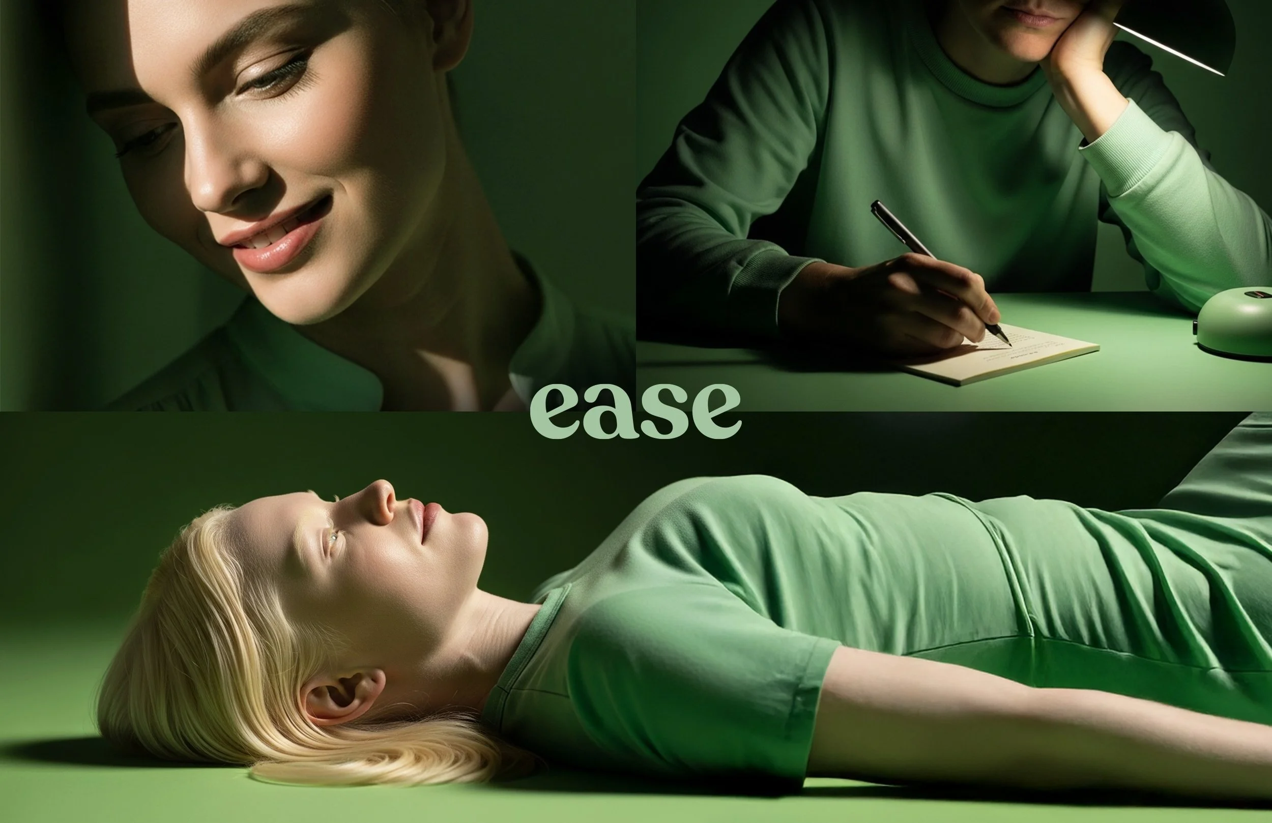
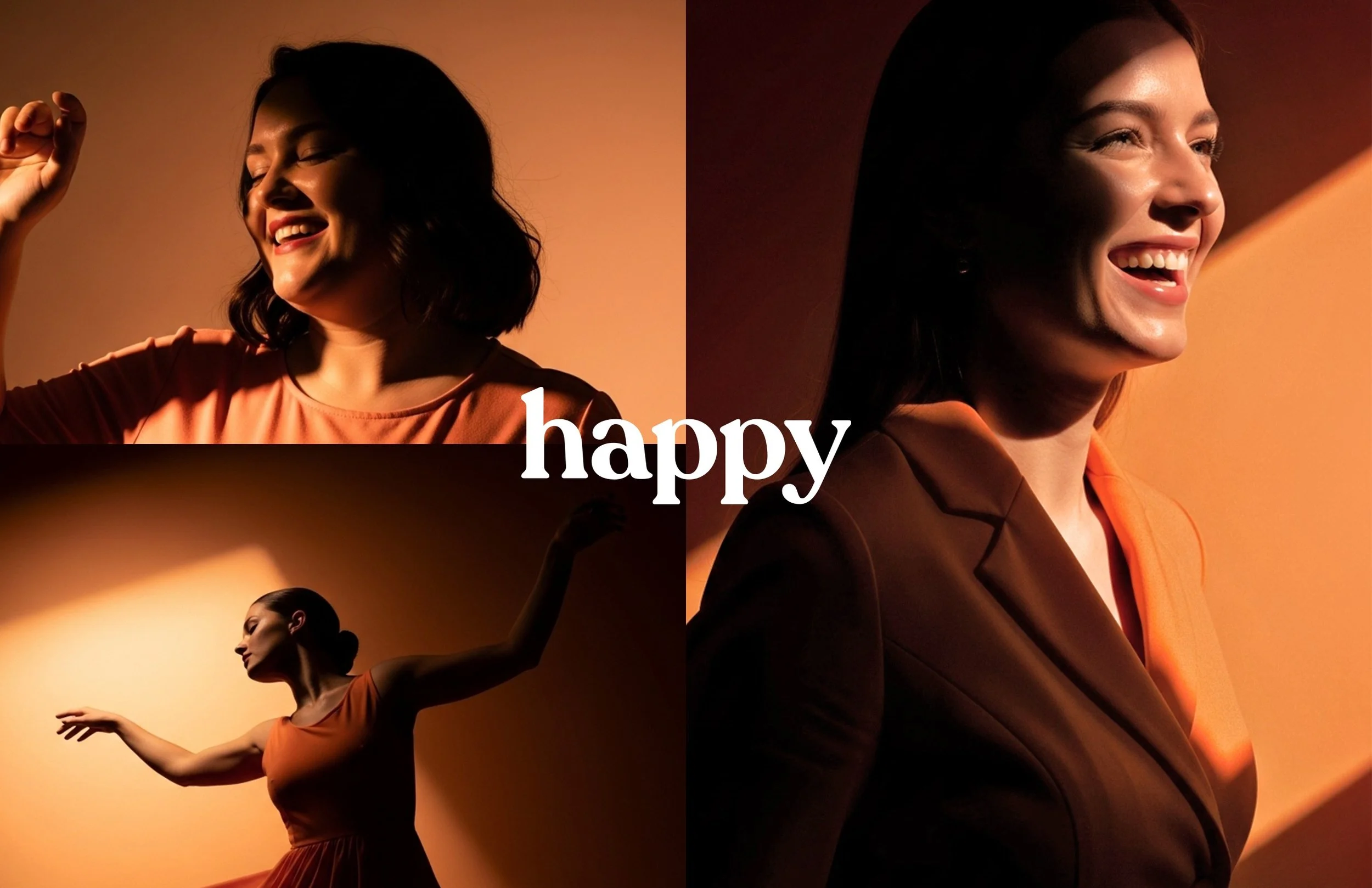
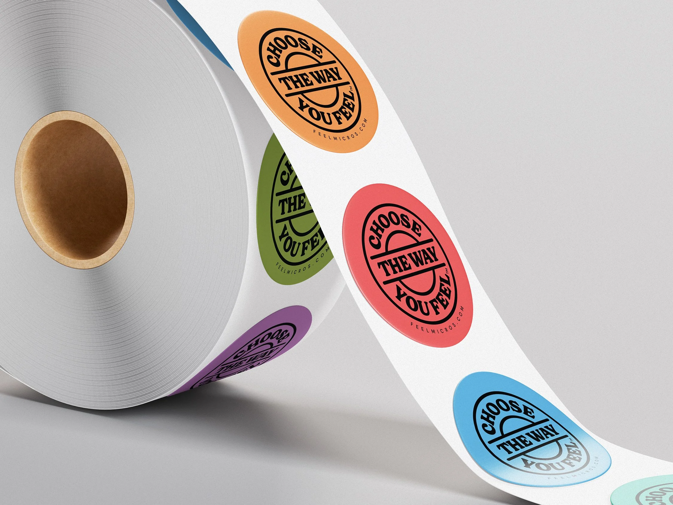
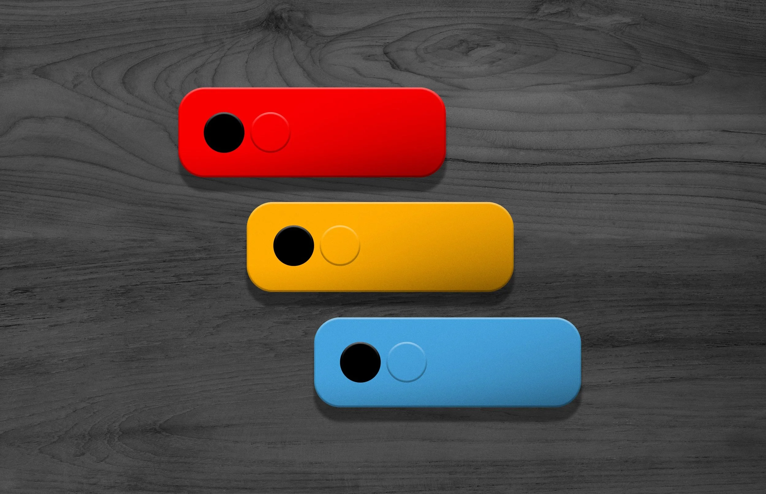
Each product’s benefit was color-coded with clarity and intention.

Red, chosen for focus, brings an energizing sense of alertness; blue, for sleep, evokes the calm of the evening sky; green, for ease, suggests the smooth flow of a green light; and orange, for happy, adds a playful and uplifting touch. Each tone is slightly muted to reflect the brand’s calm, peaceful essence.

Two red packets of dietary supplement on a wooden surface, one partially open to reveal instructions and ingredients list.
A pink box of Micro Genius dietary supplement pills and a pink packet labeled 'Focus' on a wooden surface.
Person wearing sunglasses and a yellow watch relaxing in a hot tub outdoors, holding a red packet, with water and rocks visible in the hot tub.
A woman with long blonde hair wearing a blue shirt holding a blue packet of sleep supplement called 'micros' with the words 'powered by botanicals & aminos' and a black circle with the text 'CHOOSE THE WAY YOU FEEL'.
A roll of adhesive labels in various colors, each with a circular logo featuring the words "Choose the Way You Feel" and a website URL, "feelmicros.com."
Colorful circular stickers with the text 'CHOOSE THE WAY YOU FEEL' and the website feelmicro.com on a white background.
Multiple padded bubble mailer envelopes in pastel colors, including pink, blue, orange, and purple, spread out overlapping each other. Each envelope has a shipping label and a circular logo with the text "Choose the way you feel."
Colorful pills around the words "choose the way you feel" on a black background.

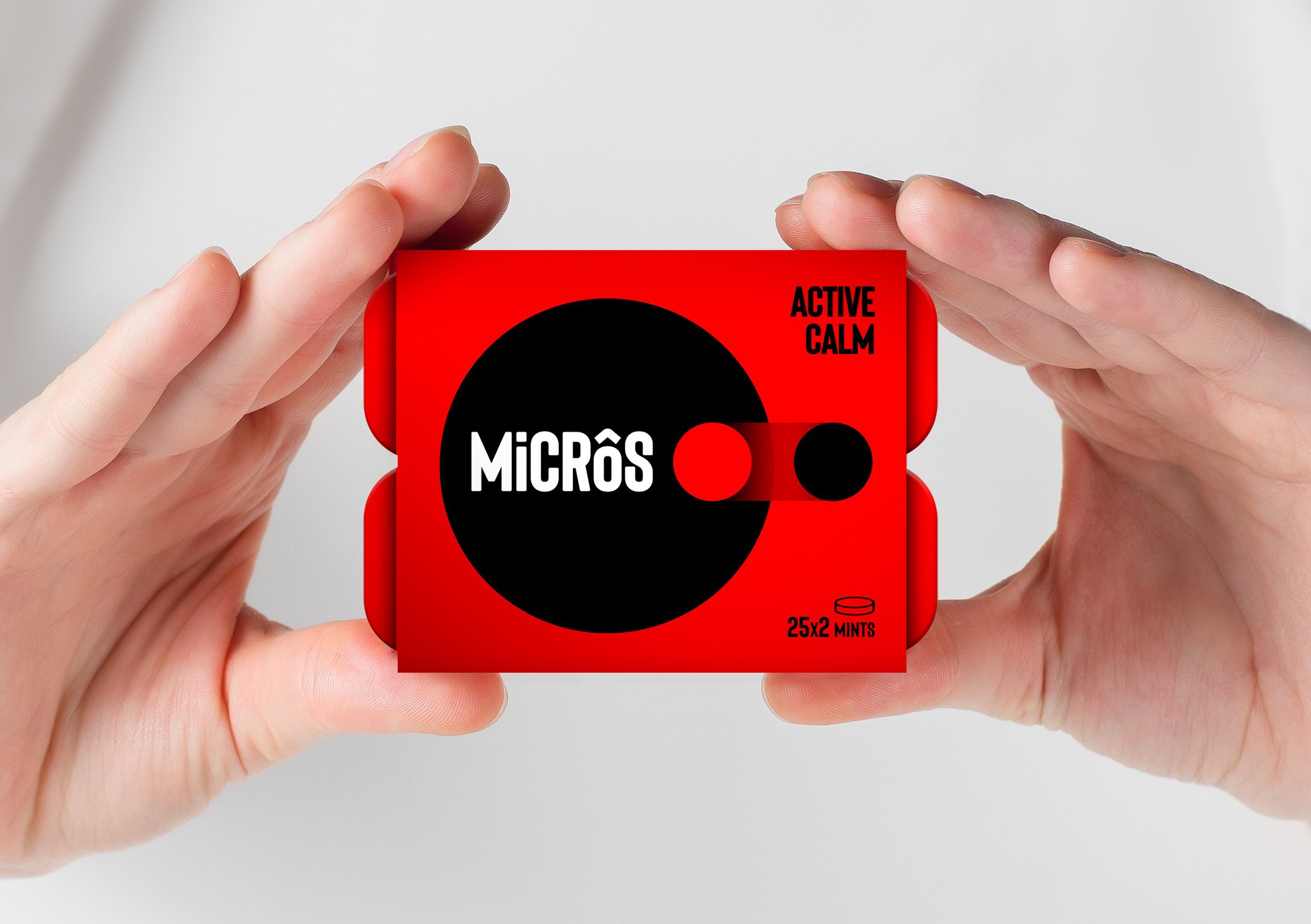
Bonus: A Look at Initial Possibilities

Design exploration for micros was a meticulous process. We closely examined the brand’s vision and future aspirations, experimenting with multiple directions to capture its essence. Below are some of the design concepts that were presented during this phase. While they didn’t make it to the final round like the approved design shown above, they reflect the breadth and depth of our creative exploration.

Close-up of a digital device screen showing three different relaxation modes: Slow, Active Calm, and Relaxed Chill, each represented with corresponding icons and color schemes.
Close-up of hands holding a black box labeled 'Active Calm' with the letters 'M', 'C', and a flower symbol, and small text '2x25' at the bottom right.
Three rectangular tabs with the Meta logo in different colors: red at the top, orange in the middle, and blue at the bottom, placed on a light wood surface.
Boxes of cannabis products with digital-style text labels indicating different strains and effects: 'Creative Flow', 'Active Calm', and 'Res'.
Hands holding a red box of micro cigarettes labeled 'Active Calm' with a black circle, smaller red and black circles, and text indicating 25x2 mints.
Three colored rectangular objects with circular buttons on a wooden surface. The top object is red, the middle object is yellow, and the bottom object is blue.

“Ozan is way more than pixels. He has a gift (and the experience) to communicate essence through design. He’s been as much a strategist as a designer. I trust him.”

  • AVIN KLINE Founder / micros