
Kre18
Born as the world’s first ready-to-drink creatine, Kre18 packed a food-tech revolution into a can, but its brand told no such story. What began as a request for packaging design evolved into a complete transformation: from generic supplement styling to a bold challenger identity, with a clear purpose, a confident voice, and a visual and digital presence that make the competition irrelevant. The product was revolutionary, but without the right story, how would anyone know?
CHALLENGE
Kre18 had cracked something extraordinary: the world’s first ready-to-drink creatine. A food-tech leap forward that should have felt like a revolution.
However, without a compelling story, a clear voice, and a distinctive visual identity, the breakthrough risked disappearing into sameness. We had to create a bold, self-assured challenger brand, one that renders the competition irrelevant.
TRANSFORMATION
Our task wasn’t to invent a story but to uncover the one that was already there. Together, we helped Kre18 see its product not as another supplement but as a category challenge, redefining how performance could be achieved: simpler, smarter, and unapologetically human. That shift gave the brand its stance. A purpose emerged that went beyond packaging and sales: to help people regain their energy, reach their peak, and stay there.
The language began to change, too. Instead of explaining “what” the product was, Kre18 learned to declare “why” it mattered and 'how' it helped people achieve their goals. A tone of voice took shape, bold, motivating, and cheekily defiant, that matched the ingenuity of the product itself. And alongside it, we built a verbal identity: structured messages, a manifesto, and a style of communication that made the brand feel alive and distinctive.
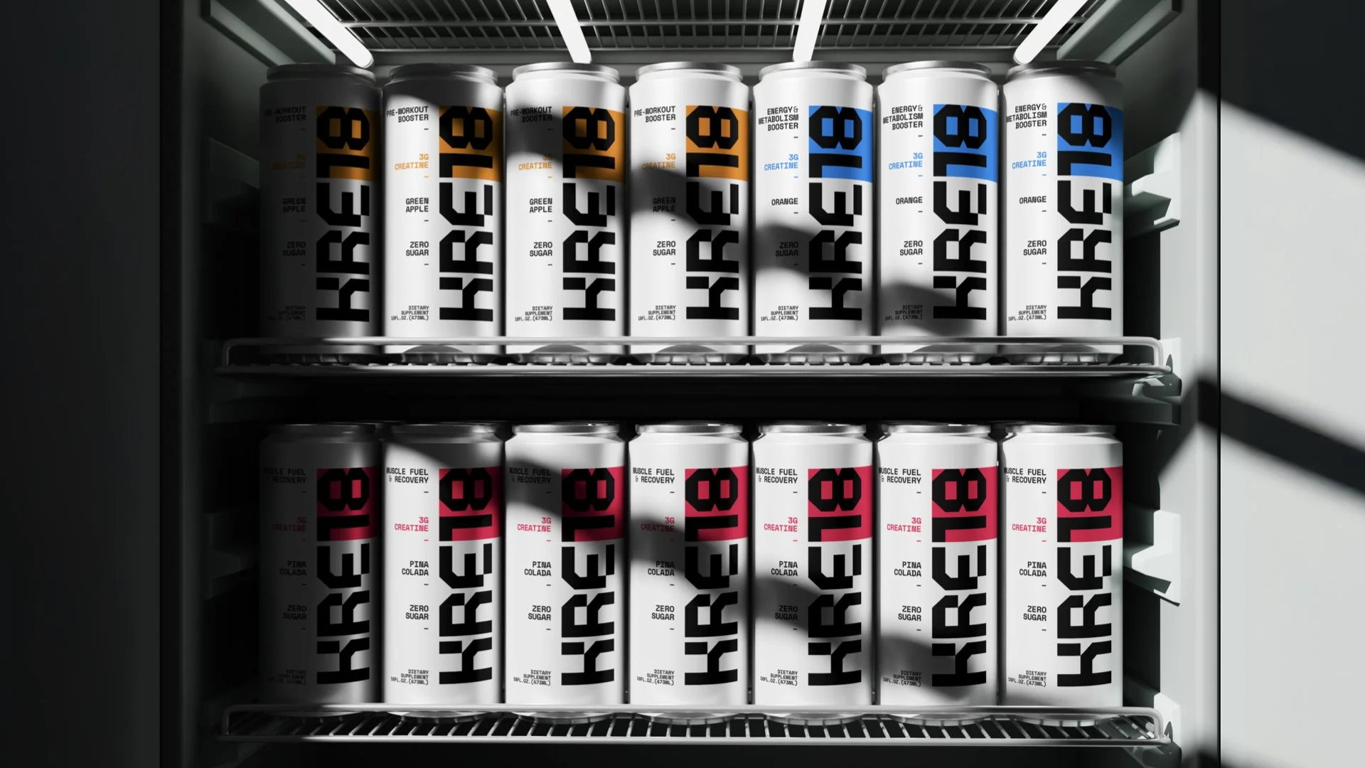
VISUAL IDENTITY
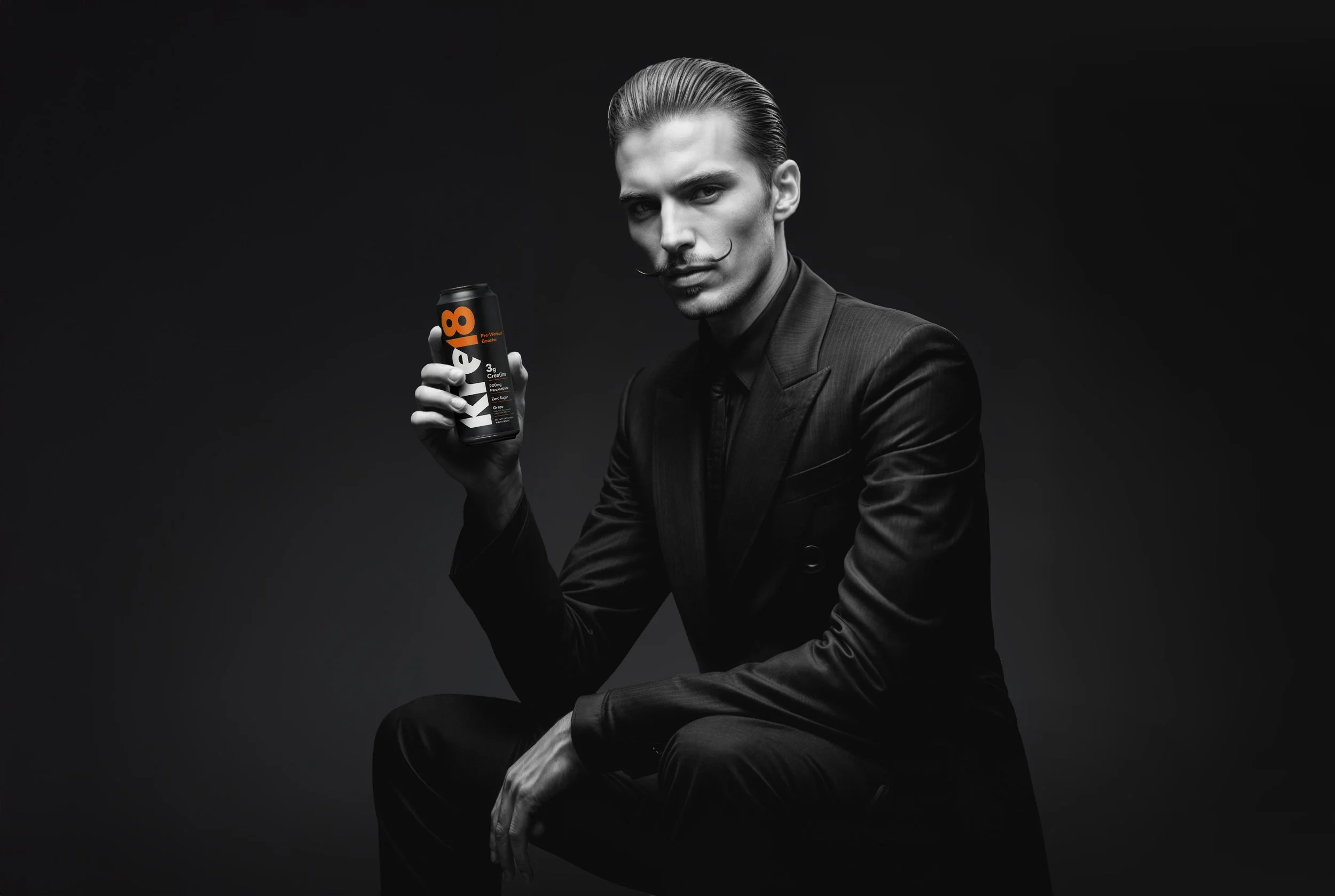
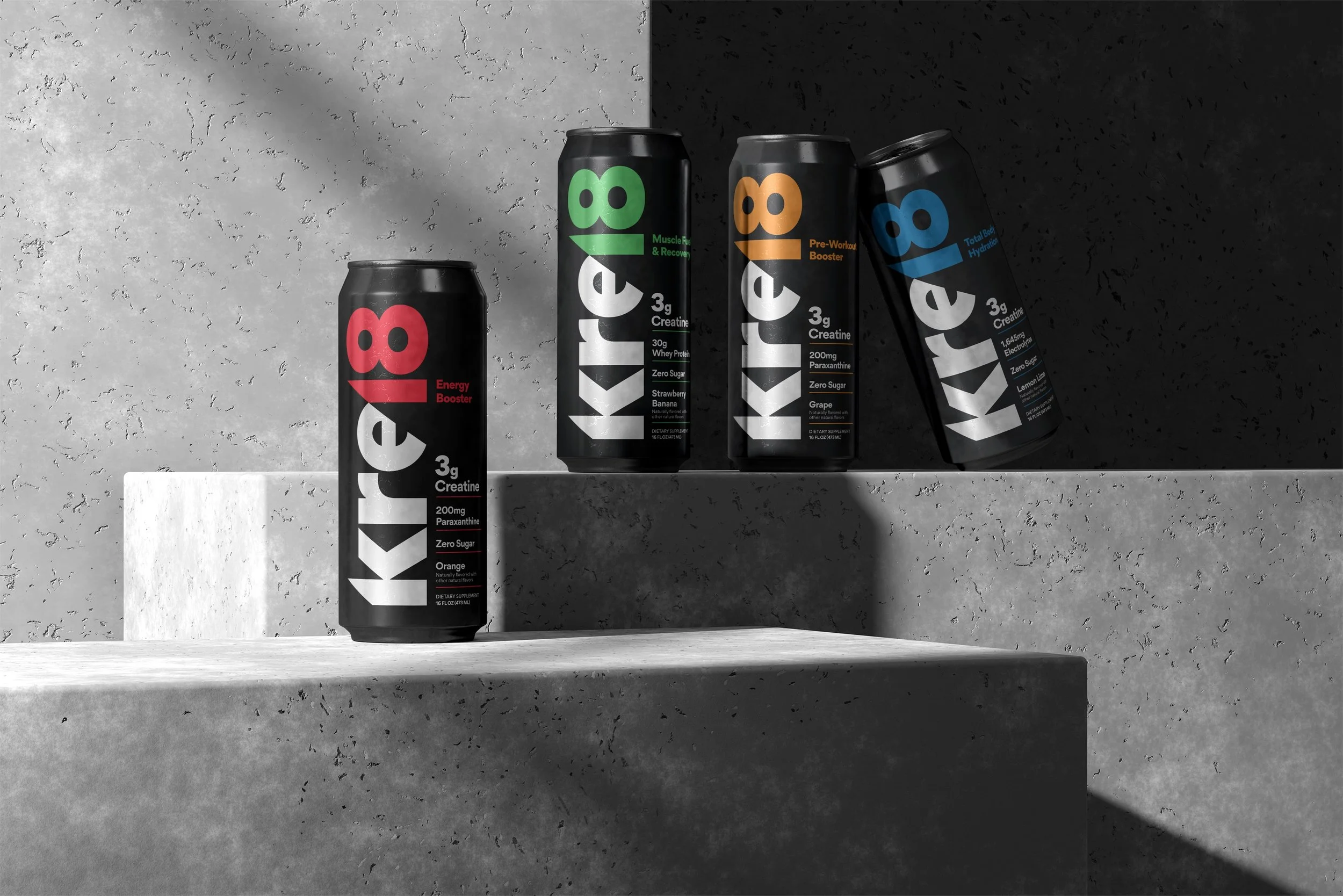
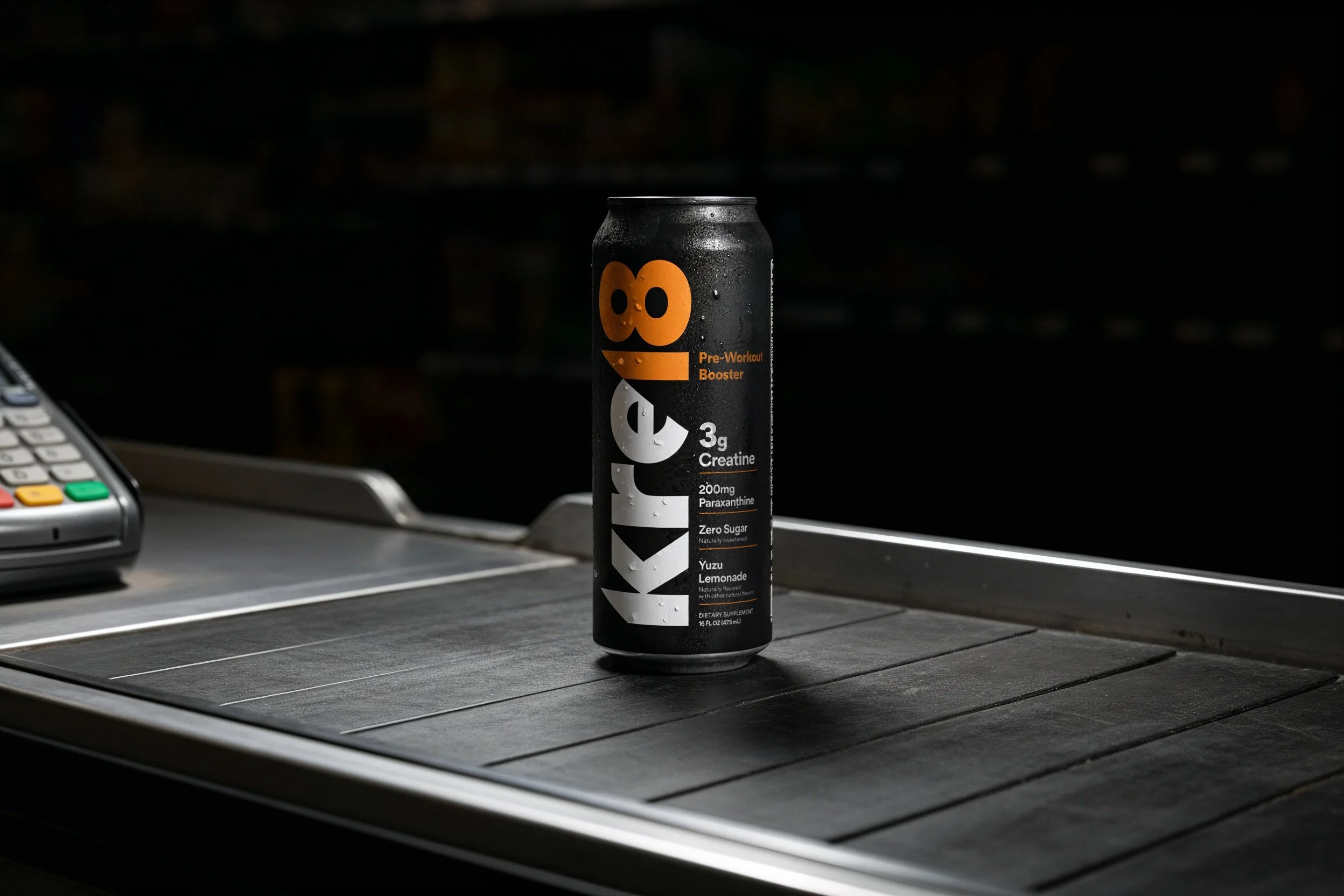
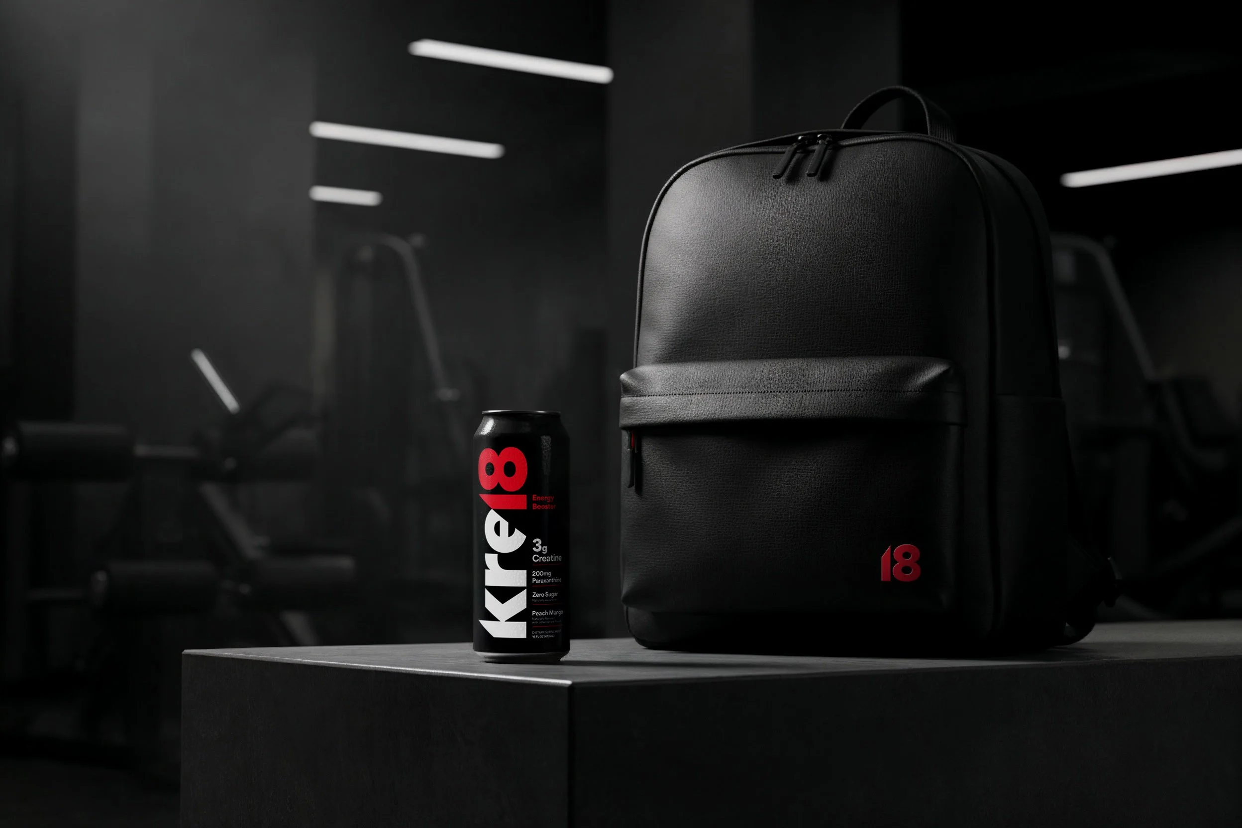
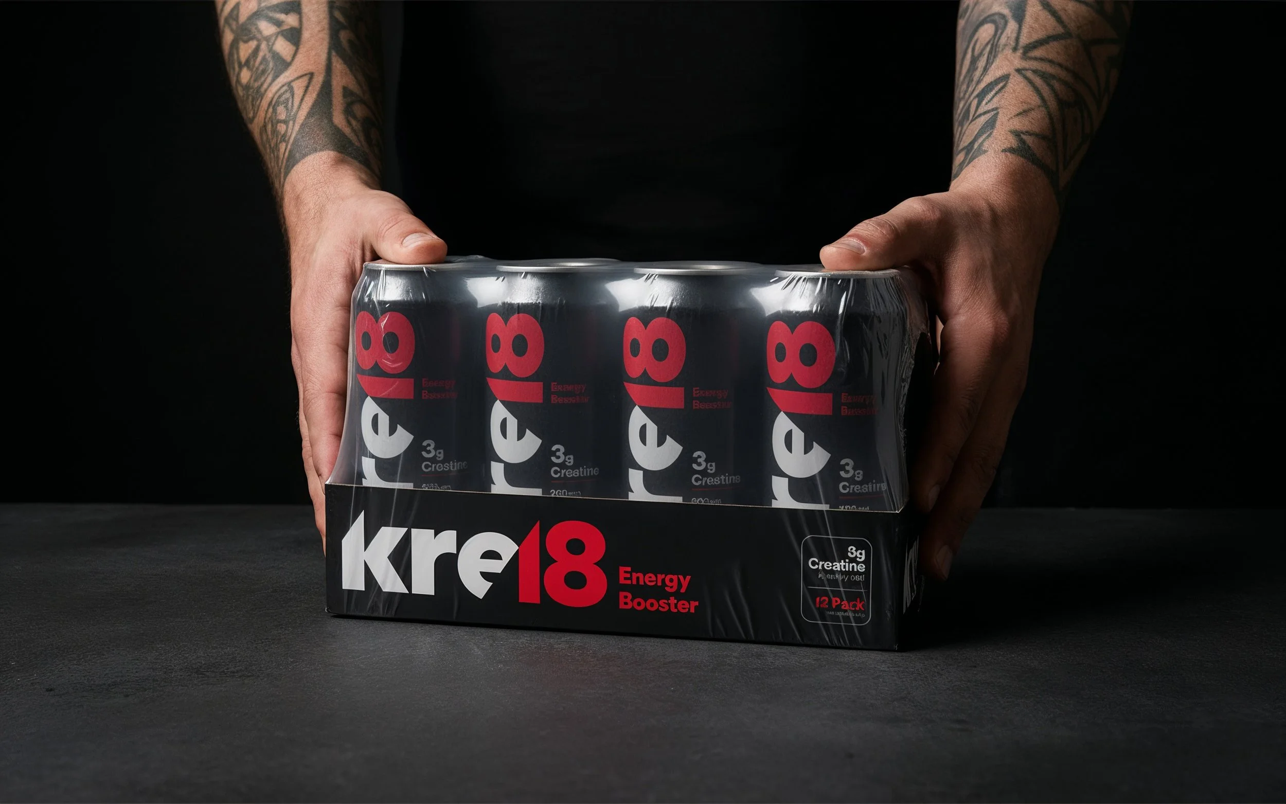
The visual identity was rebuilt from the ground up. We moved away from the generic codes of the supplement industry, and created a system that reflected clarity, wit, and innovation.
The new logo embodies simplicity and confidence, a mark that feels modern and agile. The color palette was designed to break free from ‘gym black’ and signal freshness, energy, and a bit of swagger. Typography was selected for precision and impact, giving Kre18 a voice that is both approachable and authoritative.
Each touchpoint of the design system; logo, colors, imagery and icons, was codified in a style guide to ensure consistency across marketing, retail, and communications. The result is an identity that not only looks striking but also behaves strategically: instantly recognizable, flexible across formats, and built for growth.


DIGITAL PRESENCE
For Kre18’s digital presence, we translated the new strategy and visual identity into an online experience that feels bold, effortless, and motivating. The design system was extended into digital layouts, photography, and iconography, ensuring every page reinforced the brand’s clarity and confidence.
The website doesn’t just host information; it tells the Kre18 story in motion. From manifesto-driven headlines to bold visuals and a tone of voice that speaks like a challenger, the digital experience works as both a storefront and a statement of identity.

OUTCOME
Kre18 moved from a product hidden in plain sight to a brand impossible to ignore. On shelf, it stands apart as the first and only drinkable creatine. In voice, it speaks like a challenger with conviction.
What began as a radical innovation in food tech is now matched by a brand with the same charge, impossible to ignore, built to lead.


BONUS: INITIAL EXPLORATION
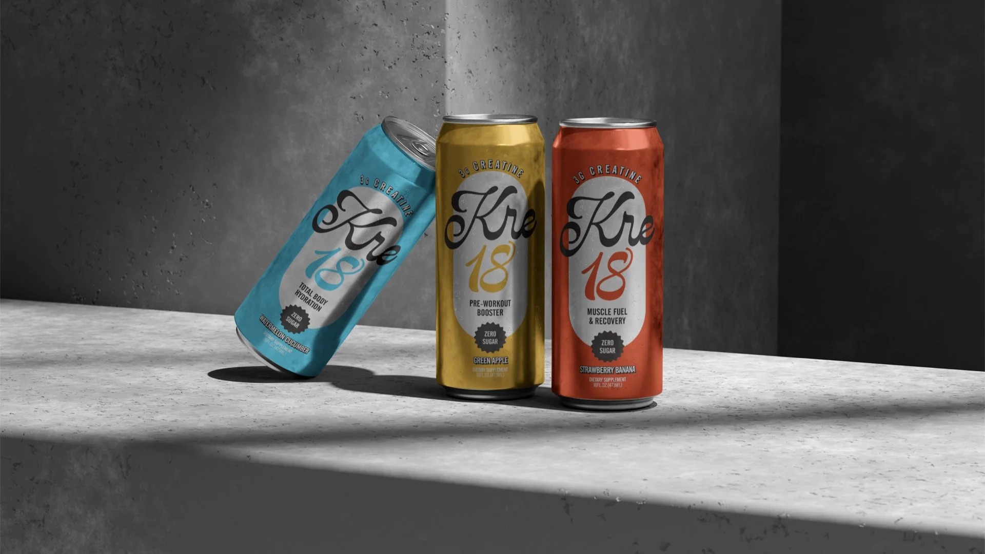
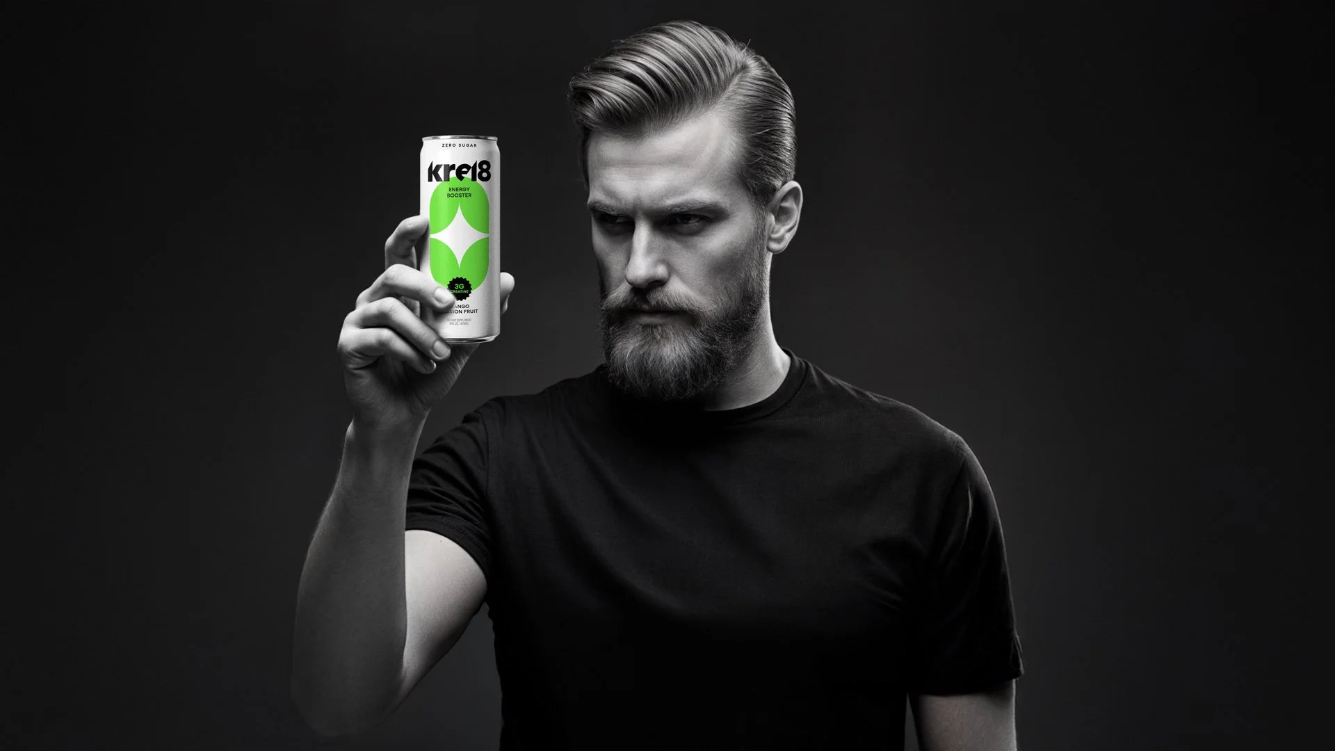
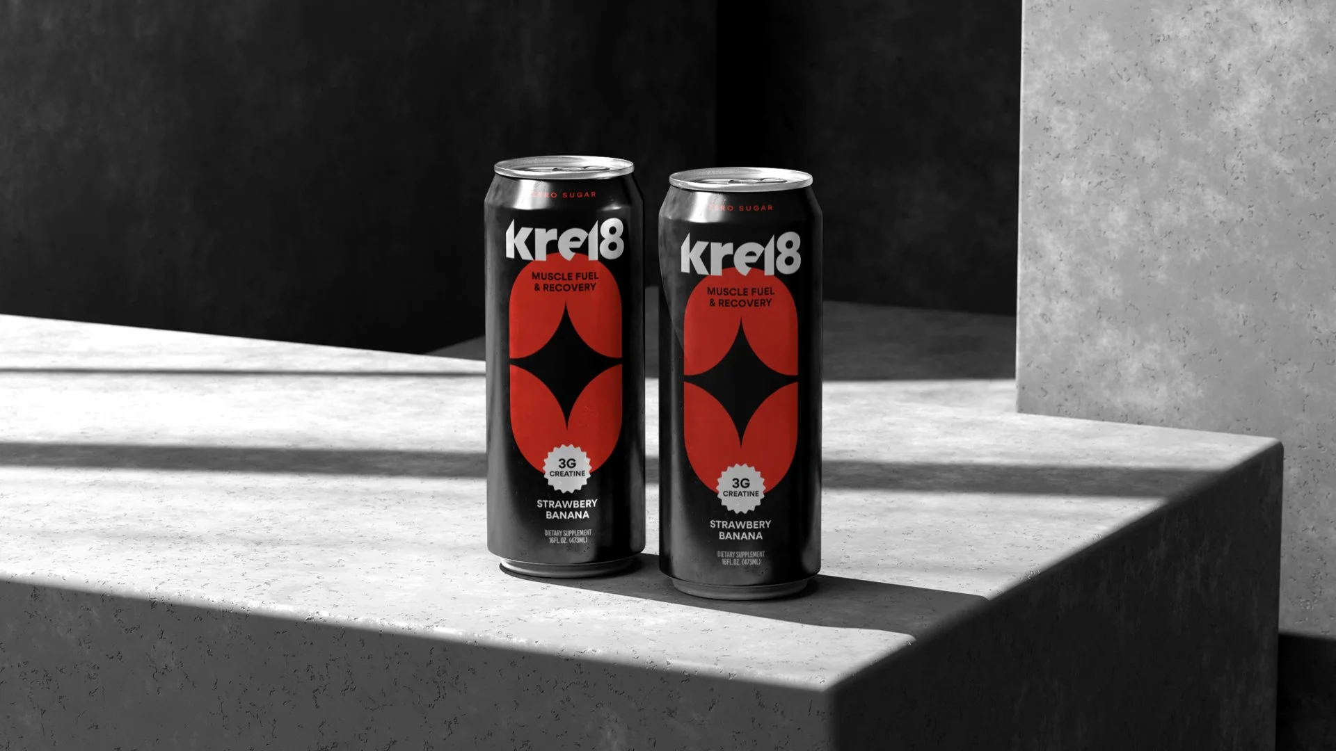
Once the brand strategy for Kre18 was defined, we moved into visual exploration, developing multiple, well-thought-out identity and packaging directions for the product. While the core strategy remained intact, each concept brought a unique interpretation of the central idea, exploring different expressions of clarity, boldness, and energy.
What follows is a selection of early design explorations from our initial presentation.


“Working with Ozan was a masterclass in creativity and precision. For our KRE18 beverage line, Ozan not only delivered brilliant design work but also helped shape the entire brand’s positioning. His ability to translate complex ideas into bold, modern visuals, and to present multiple, equally compelling creative directions, was remarkable. He has that rare mix of imagination, strategic depth, and design mastery. His designs always come with a wink, a spark of humor that makes people smile while getting the message instantly. The results exceeded all expectations.”
SAMIL OZAVAR Founder / Kre18