
Why Do Brands Rebrand?
You must be noticing that some brands around you go through rebrands. Sometimes it’s just a refinement of the logo, sometimes it’s a complete overhaul with new strategy, brand identity, packaging, website, and more.
But why does this happen?
Is it simply to look fancier? To follow trends and attract younger audiences? To stay relevant? Or is there something deeper going on? Let’s break it down.

1. THE BUSINESS HAS CHANGED
Sometimes, things change in a brand’s journey. They expand their product lines, shift their focus, or maybe evolve from a humble start-up into a mature company.
At that point, the existing identity becomes problematic. Sometimes limiting, misleading or even irrelevant.
In late 2010’s, Dunkin’ Donuts realized that more than 60% of their revenue was coming from beverages. It was not anymore a donut company that happen to sell coffee. It was a coffee company that happen to sell donuts.
To be able to reflect that and compete more directly with industry leaders like Starbucks and McDonalds, they made a bold decision, changed their 68-year-old name and dropped the word ‘Donuts’.
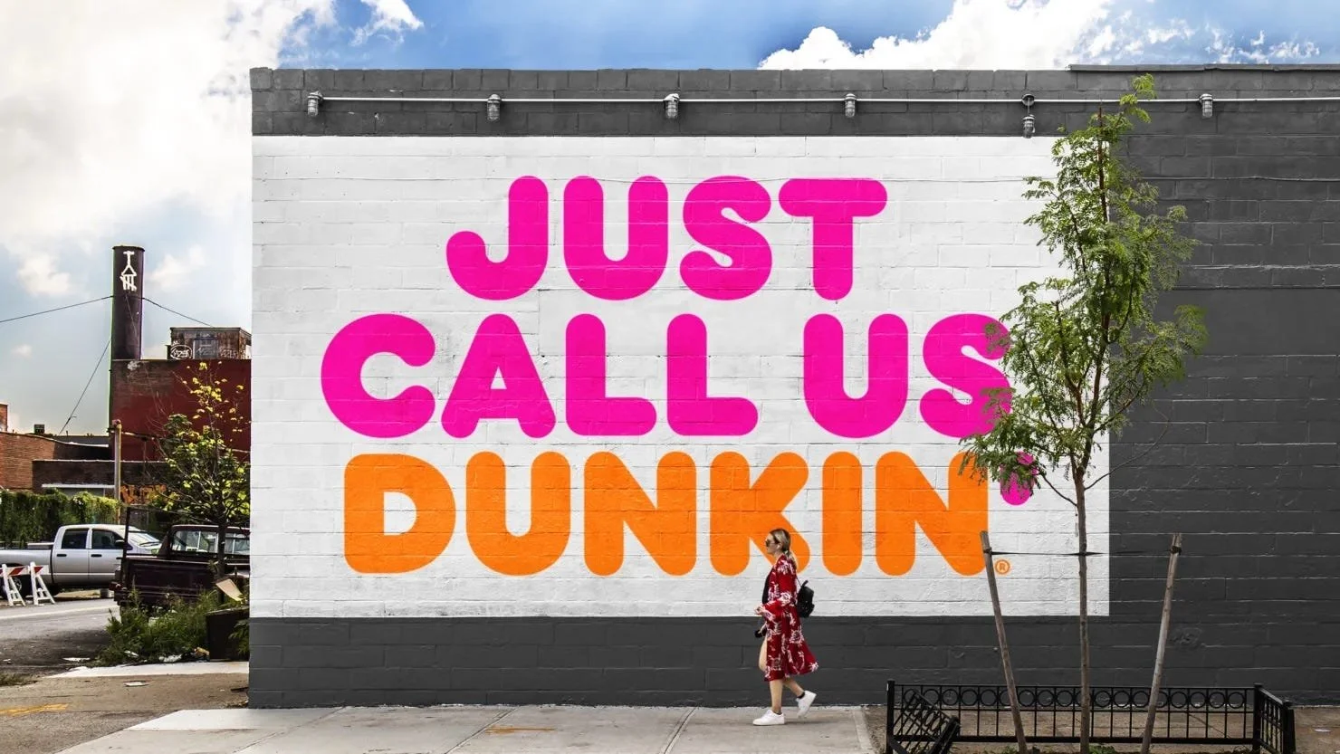
Dunkin’ Donuts officially rebranded to Dunkin’ in Janury 2019.
Dunkin’ Donuts officially rebranded to Dunkin’ in Janury 2019.
About 10 years later, the world-famous, highly rooted Italian soccer team Juventus made a shocking change in its logo and overall visual identity. Their previous logo was only a slightly refined version of their very first one, that was released with the foundation of the club in 1905. In other words, they destroyed a huge visual heritage for an ultra minimalistic new identity. Fans were split. Some thought it was a betrayal to the club history, while some others found it refreshing and revolutionary.
But aside from emotions and personal taste, there was a solid reason behind Juventus’ rebranding project.
After that big, bold move, the word “Juventus” appeared above the new J symbol. Once the symbol reached a certain level of recognition, they dropped the wordmark entirely. Now, the J symbol is nearly as recognizable as Nike’s swoosh, Apple ’s apple, and Levi’s’s batwing logo.
Juventus’ logo/crest solely represented the Juventus soccer team. Any sports fan would immediately recognize it and connect it to the club. However, Juventus had bigger ambitions. They wanted to become ‘a global lifestyle brand’. While proudly keeping their soccer team’s proud existence, they wanted to expand into fashion, entertainment, digital products and global partnerships.
Old crest worked perfectly in soccer contexts, but too detailed and club-centric to stretch into those new areas.
So they significantly simplified the logo and made a huge impact in the industry.
In both examples, businesses changed and rebranding became a necessity.
2. THE BRAND HAS LOST ITS EDGE
Sometimes, brands still work, but not as well as they used to. Maybe their style aged poorly. The trend they once followed disappeared. Or maybe their competitors caught up, forcing them to leave their comfort zone after many years.
This can either lead to a radical change like Juventus’, or just a refinement that helps them keep up with the changing atmosphere. No matter what, the goal is the same: Stay sharp and recognizable in a crowded market.
Pepsi falls under this category as a good (and bad) example. The company has always tended to follow the trends, and therefore, couldn’t find a truly unique, memorable identity. Generations replace one another, trends change, and old ones expire. Every now and then, Pepsi rebrands to catch up, but its response is mostly reactive rather than visionary.
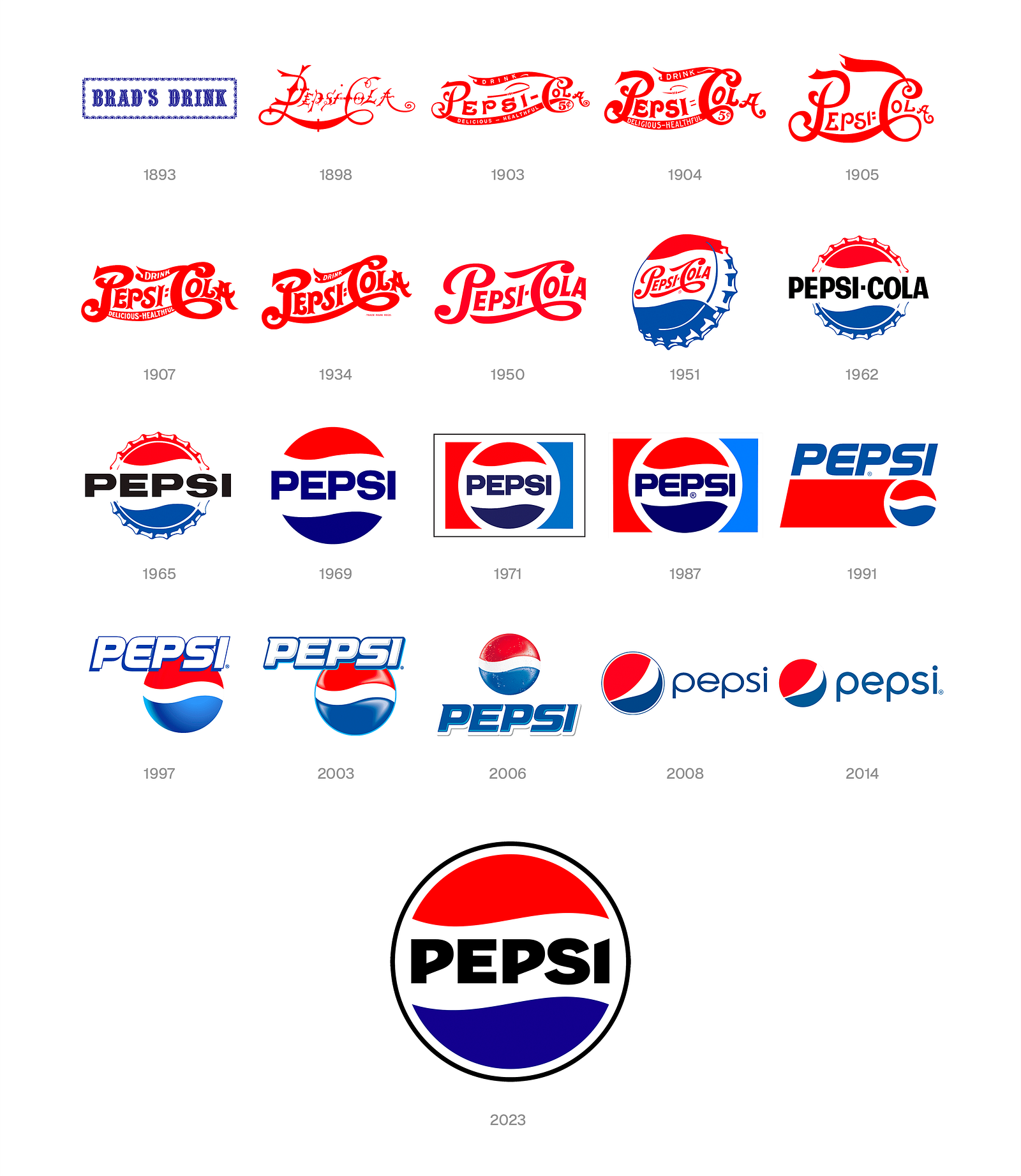
While Coca-Cola preserves its essence strongly and consistently, Pepsi often loses track of its identity, and puts too much effort into becoming relevant again. Do they need rebranding? Always. Do they do it right? Not really.
Now, let’s take a look at another example.
In 1990s, Swedish food scientist Rickard Öste devleoped a new technology to turn oats into liquid food while researching alternatives to cow’s milk. In 2001, he founded his consumer-facing brand, Oatly.
For its first 12 years, Oatly only served Nordic countries. While it was quite successful there, its revenue was limited. In 2013, the company entered the UK and German markets. What changed everything for Oatly happened in 2014: A comprehensive rebranding project.
They completely redefined how the brand thinks, speaks and connects, and reflected that perfectly through their new packaging and iconic advertising campaigns. From 2014 to 2025, their revenue grew from 39.5 million dollars to a whooping 862.5 million dollars, without a single year of decline.
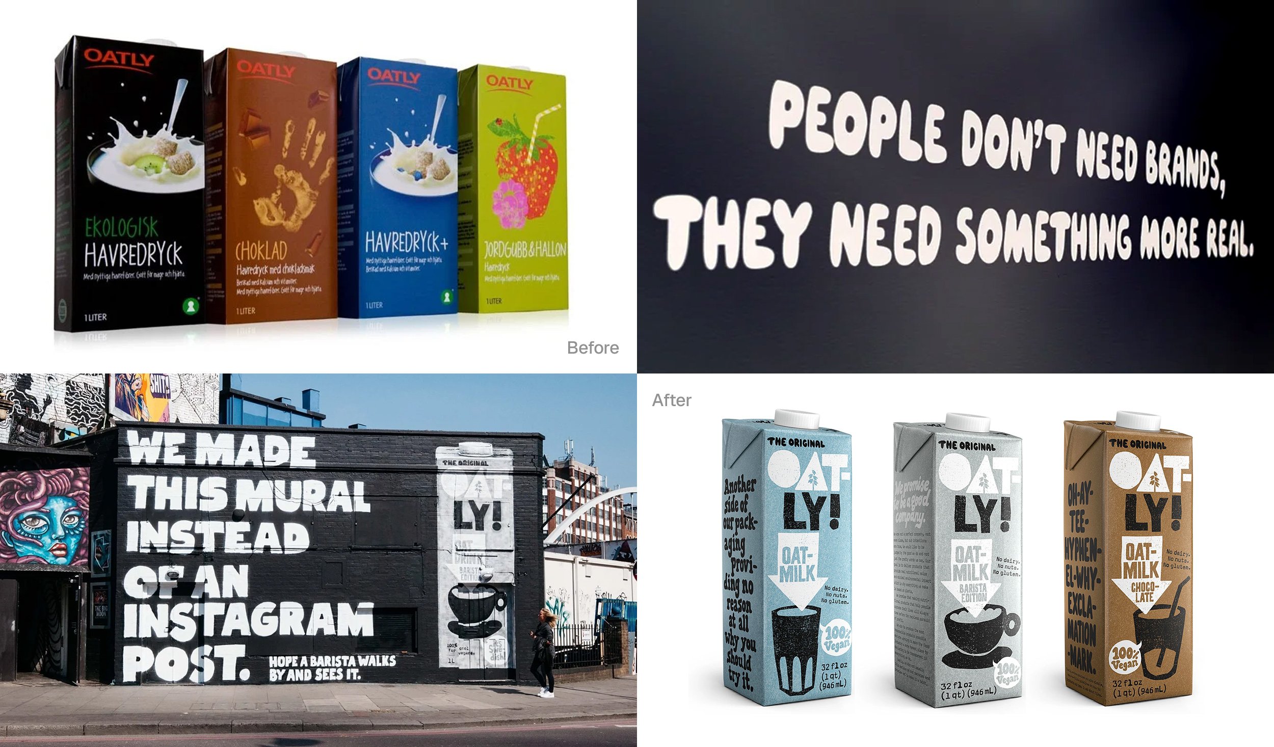
Great strategy, highly distinctive design, and perfect timing transformed Oatly from a humble local company into a global giant in its field.
Pepsi rebrands to stay visible. Oatly rebranded to become ‘bigger than its category’. Similar starting points, completely different approaches, completely different outcomes.
3. THE BRAND WAS NEVER RIGHT TO BEGIN WITH
Start-up companies are often built quickly, with limited strategy, tight budgets, or inconsistent execution. They don’t prioritize branding, or sometimes they underestimate its importance, and as the company grows, things start falling apart.
At some point, the company realizes that what it started with didn’t actually represent it. Its messaging becomes inconsistent, communicating properly with the target audience gets harder and harder, and poorly designed materials fail to reflect the high quality of its product or service. A lack of a professional branding approach causes them get stuck.
That’s when a rebrand becomes not only helpful, but crucial.
Airbnb was one of those companies. In its first seven years, it operated under three different brand names and five different logos. They didn’t have a defined, distinctive, and consistent personality. One day it felt like a tech startup, the next day, a budget accomodation platform.
People had a hard time understanding what Airbnb stood for.
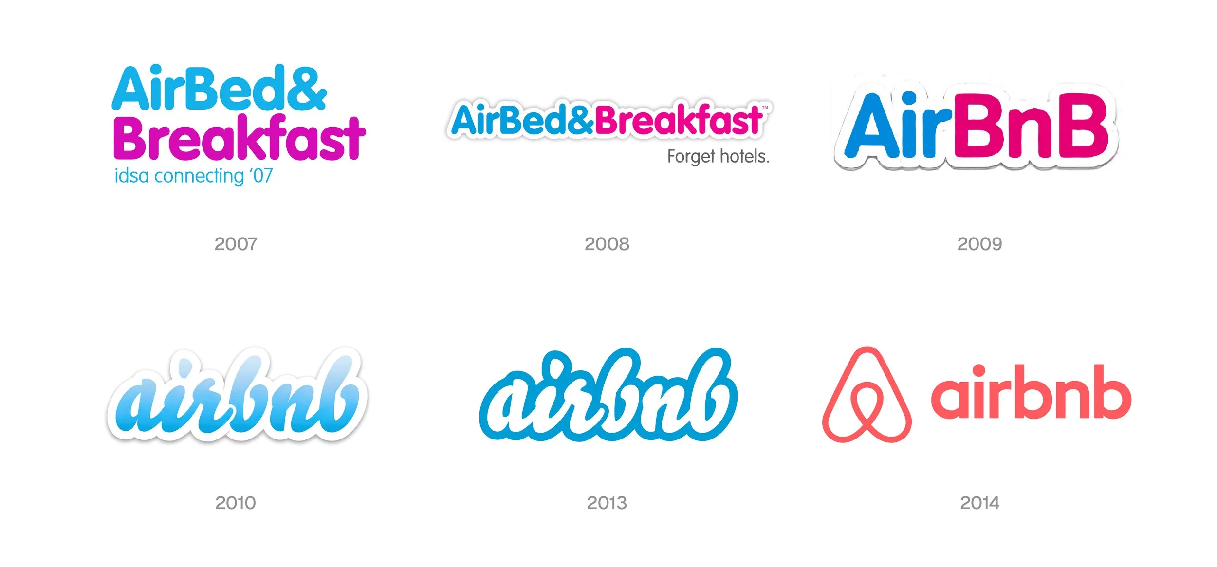
In 2014, they went back to the whiteboard and rebuilt the brand around a core idea: ‘Belong Anywhere’. That strategic leap gave Airbnb a much clearer cultural identity, helped it move beyond its ‘cheap alternative’ perception, and unified its messaging through a strong new logo and design system.
Growth can hide branding problems for a while until the company becomes too big to stay inconsistent. Then rebranding becomes inevitable.
Rebranding is one of the most important stages a company can go through.
A wrong strategy, poor execution, or bad timing can create problems much bigger than you might imagine.
On the other hand, abrilliant strategy, excellent execution, and the right timing can transform a humble, promising company into a rapidly growing, industry-leading brand.
Deciding whether to rebrand or not can be overwhelming. But It’s OK. That’s why we exist :)